CPDMS.net Data Analysis provides all of the functions necessary to statistically analyze specific groups of cancer patients. The primary purpose of collecting detailed information on cancer patients is to learn from the experience of managing these patients; thus Data Analysis is one of the most important components of CPDMS.net.
The tools in this component require user input into two major areas: what group of patient records is to be studied, and which types of analytical reports are to be generated.
The first step is to select criteria for the patient records to be included in the analysis. For example, a group may be selected consisting of breast cancer patients with infiltrating ductal carcinoma, who were diagnosed at AJCC stage group 2 or 3, and who had surgery and chemotherapy. A second group may be selected consisting of patients to analyze along with, or compare to, the first group. Continuing with the above example, the second study group may include breast cancer patients with infiltrating ductal carcinoma, diagnosed at AJCC stage group 2 or 3, who had surgery but no chemotherapy.
Each user may create and save as many study groups as desired. Up to two groups may be used for calculation of a statistic, report, or graph.
The second area of specification requires selecting the type of report to be created. These include ordered lists of the values in specific fields, descriptive and comparative statistical reports, and survival rates.
Note that incomplete records are NOT included in data analysis.
Users may view instructional tutorials below on a variety of data analysis procedures:
How to edit and copy a study group
Descriptive tools (counts and data list)
Create a Study Group
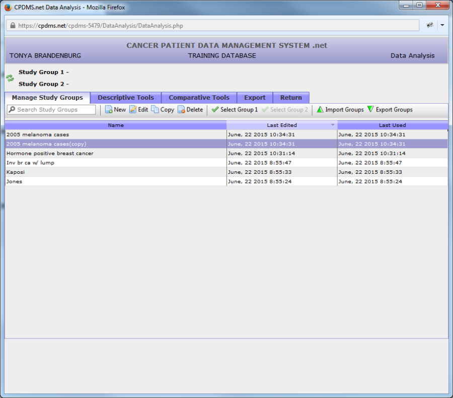
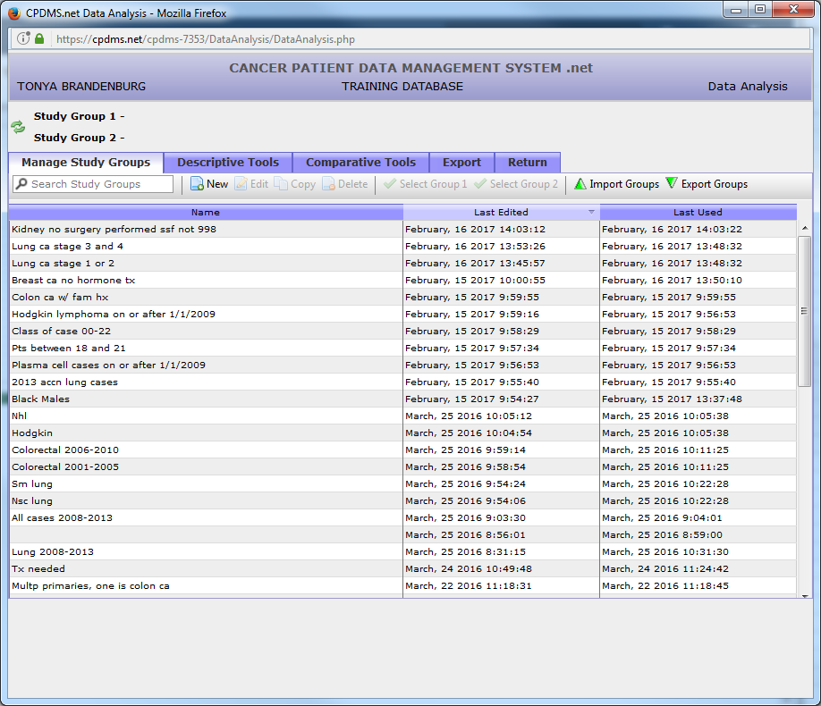
From the Main Menu, highlight Data Analysis and select "Manage Study Groups." The following screen appears:
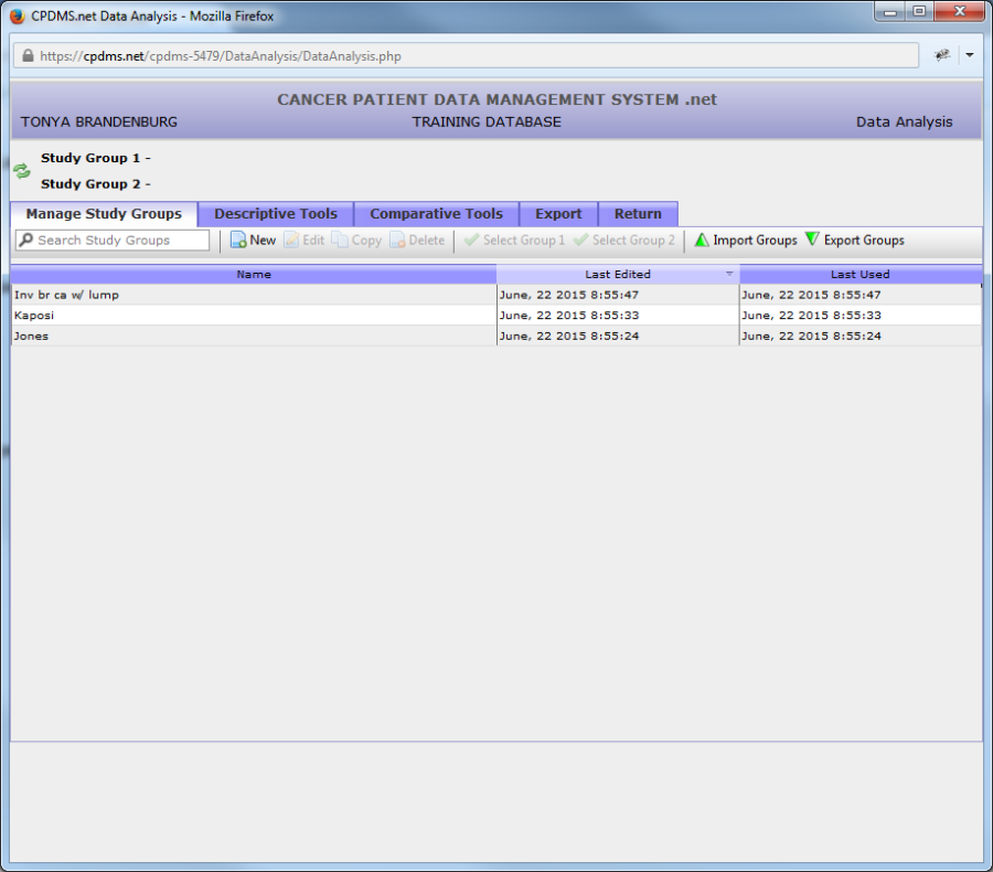
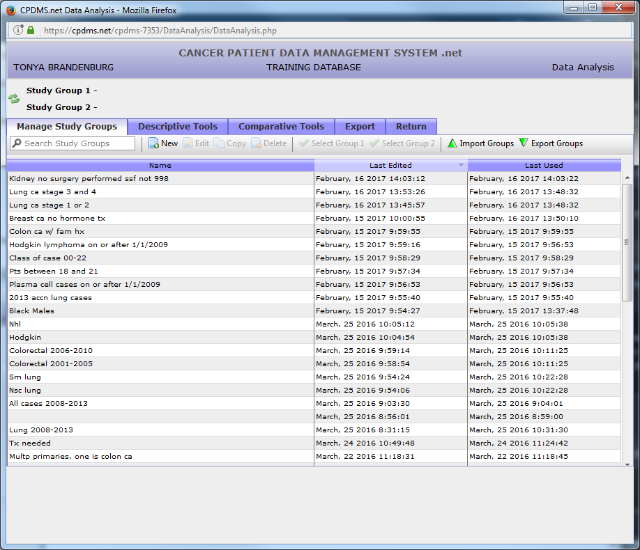
All existing study groups are listed here. Click once on the column labeled "Name" to list the study groups alphabetically in ascending order. Click on the column heading a second time to re-order the list in descending order. Study groups may also be ordered by the date each was last edited or the date each was last used by clicking on their column headings. You can search for study groups by using the search study groups box under the manage study groups tab.
From this screen, study groups may be created, edited, copied, deleted, or selected for analysis. You can also search for study groups using the "Search Study Groups" box under "Manage Study Groups" tab.
In order to create a new study group, click on the "New" button in the Manage Study Groups toolbar.
The Study Group Editor will open in a new window, as seen below:
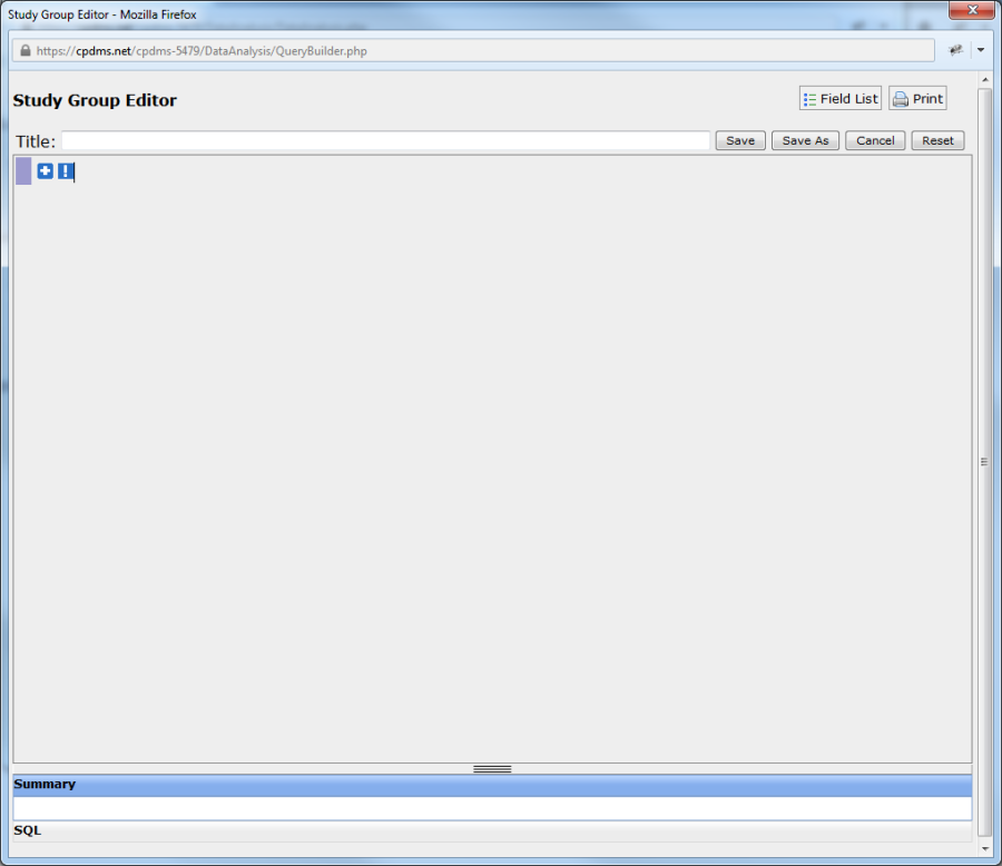
Study groups are created and edited using the Study Group Editor. In order to select a specific group of patients to study, click the "plus" button in the upper left corner of the screen to add an expression.
A blank expression has appeared and the blue "plus" sign is now a red "minus." Clicking the "minus" button will remove the expression.
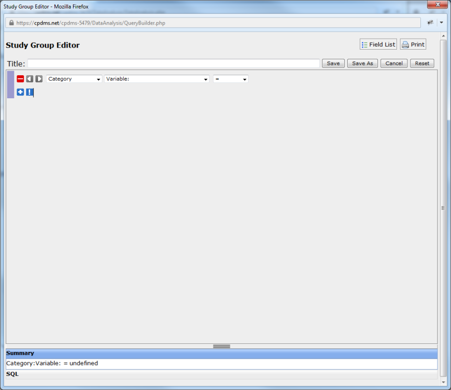
To construct an expression, first select the record level of the field to be added from the drop-down menu labeled "Category."
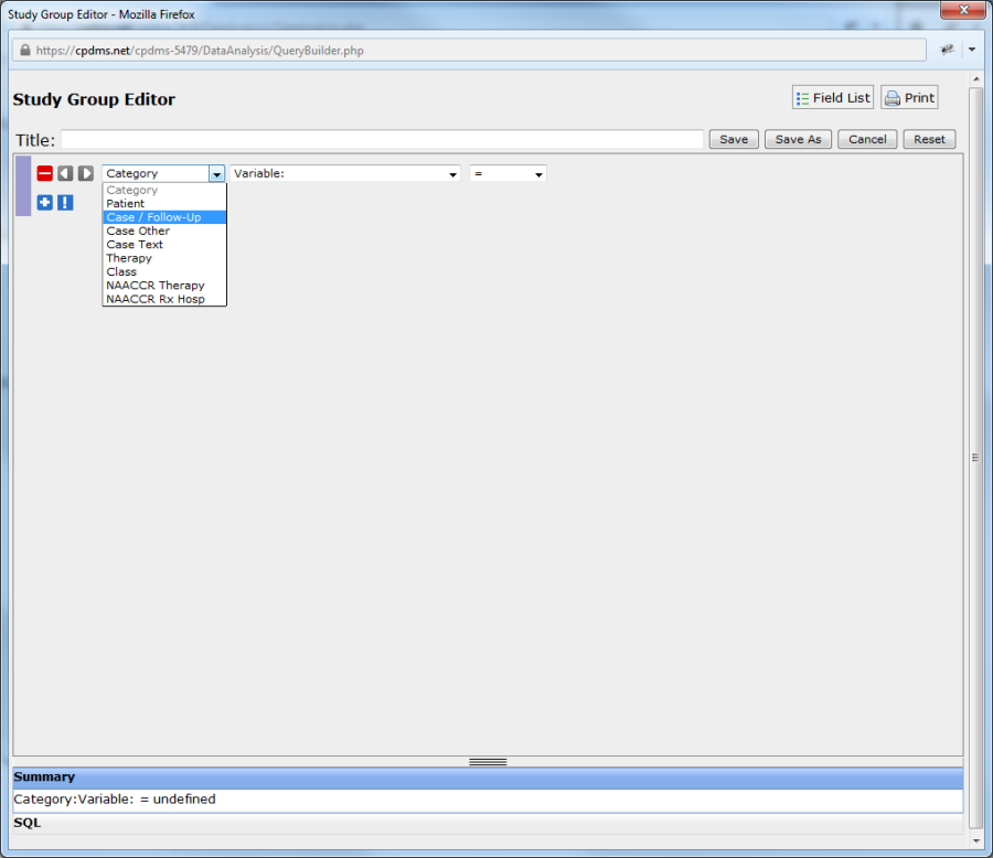
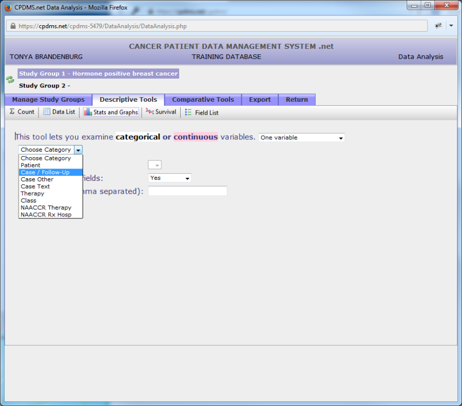
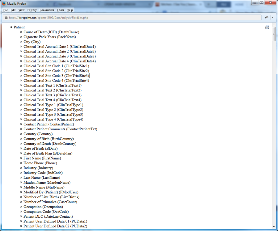
The categories available are Patient data, Case/Follow-Up data, Case Other, Case Text, Therapy data, Class History data, and NAACCR Therapy data. To see a comprehensive list of the variables contained within all these categories, view the Field List (available by clicking on the "Field List" button within the Manage Study Groups menu).
Once a category has been selected, next choose a field by clicking on the drop-down menu labeled "Variable." (See example below.)
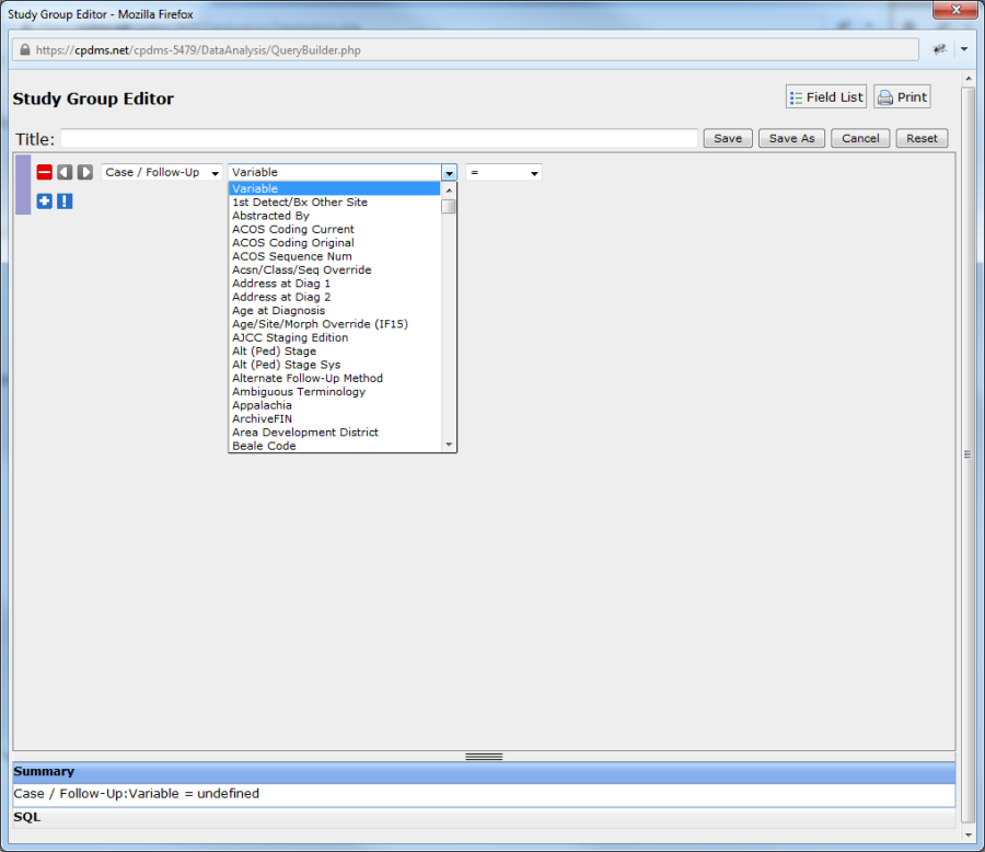
The fields are arranged alphabetically within the list. Move through the list using the scroll bar, or press a letter key to jump directly to fields which start with that letter (i.e. hitting the "R" key while within the list moves instantly to the first field that starts with an R). Select the desired field by clicking on it.
The next step in constructing an expression is selecting a relational operator. Click on the drop-down menu containing the "equal" sign to display the list of relational operators.
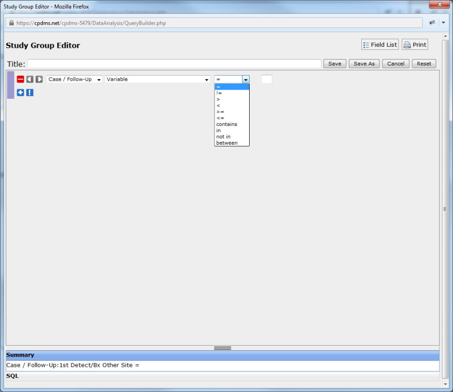
These operators define the "relationship" between a value found in the patient record for the field specified, and the value chosen to complete the expression.
A list of the relational operators and their definitions is given below, in the order in which they appear in the drop-down menu:
EQUAL (=) – the field value in the patient record must be exactly the same as the value chosen in the condition in order for that record to be included in the study group
NOT EQUAL (!=) – the field value in the patient record must be anything other than the value specified in the condition in order for that record to be included in the study group
GREATER THAN (>) – the field value in the record must be greater than the value chosen in the condition. Alpha characters are considered greater than numbers or blanks; thus, A-Z is greater than 0-9, which is greater than a blank.
LESS THAN (<) – the field value in the record must be less than the value specified in the condition.
GREATER THAN OR EQUAL TO (>=) – the field value in the record must be exactly the same or greater than the value chosen in the condition.
LESS THAN OR EQUAL TO (<=) – the field value in the record must be exactly the same or less than the value specified in the condition.
CONTAINS – the value in the patient record must contain the exact character string that was specified in the condition. The character substring may appear anywhere in the field value and the record will be included in the study group.
IN – the value in the patient record is the same as one of the values selected in the condition. An unlimited number of values may be specified.
NOT IN – the value in the patient record is anything other than the values selected in the condition. An unlimited number of values may be specified.
BETWEEN - the field value in the record falls within a range of values chosen as the condition. The boundaries selected are included in the range.
A relational expression performs a comparison between two values: one in the database and one in the condition. If the relational expression is evaluated as TRUE, then the record being compared is included in the study group. If the expression is evaluated as FALSE, then the record being compared is not included in the study group.
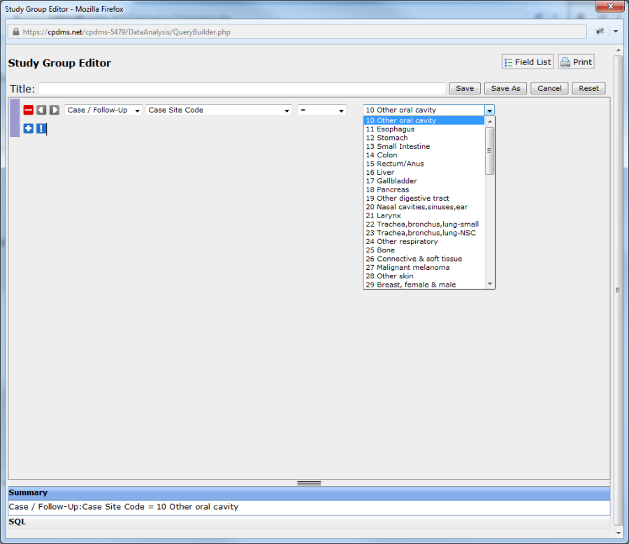
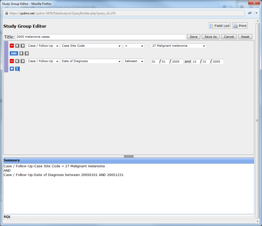
Choose a value for the expression. If the field has a Choice List, the value may be selected from a menu. Fields that do not have a Choice List have a blank box which is filled in by the user. In the example below, the field "Case Site Code" has a drop-down menu.
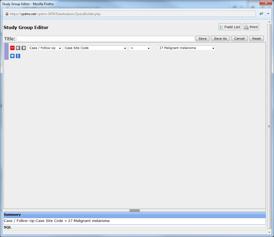
Now a complete relational statement (Case Site Code = 27) has been constructed. This condition may be removed by clicking on the red "minus" sign to the left of the statement. A query may have an unlimited number of conditions.
Note that as an expression is constructed, it also appears beneath the blue bar labeled "Summary." Users may view the query as it appears written in SQL (the language used by CPDMS.net to process the query) by clicking on the gray bar labeled "SQL.'
The screen below shows the previous example query as it appears in SQL. Return to Summary view by clicking on the gray Summary bar.
A hard copy of a query (in either Summary or SQL view) may be obtained by clicking on the printer icon in the upper right corner of the screen.
To add another condition, click on the blue "plus" sign beneath the first expression. A blank condition appears directly below the existing expression.
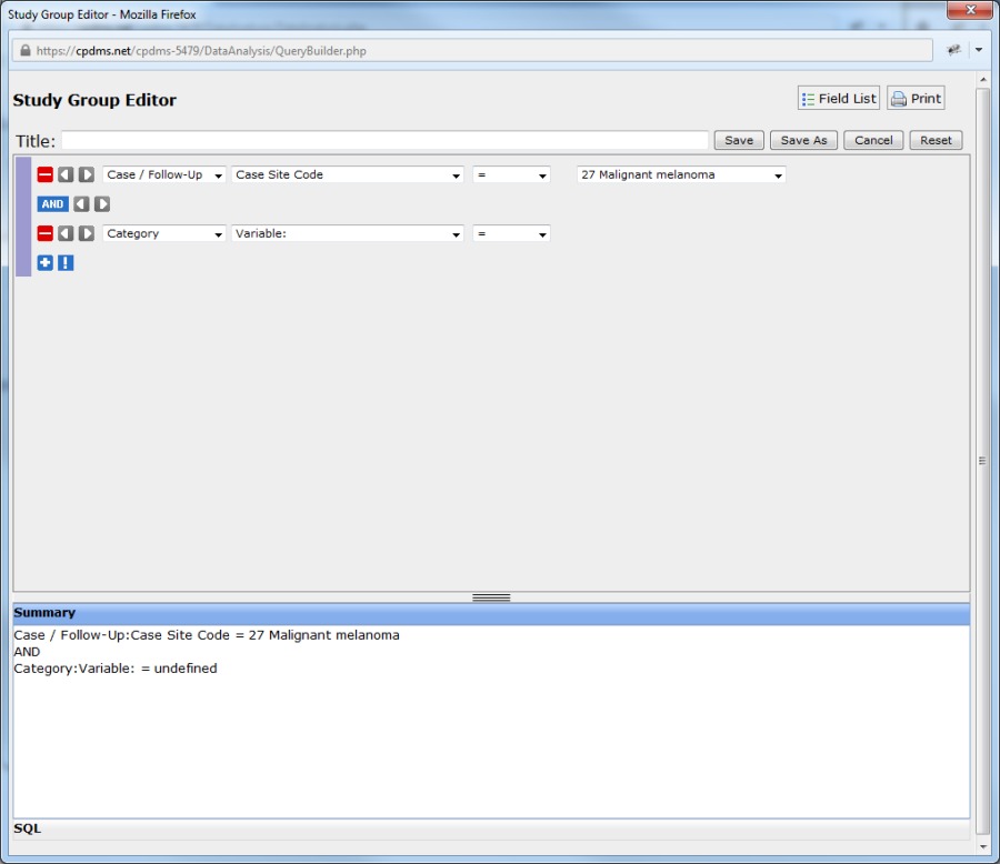
Note that now the Boolean operator "AND" appears between the two expressions. Clicking once on the word "AND" changes the operator to OR. Clicking again changes it to XOR (exclusive OR).
These three terms are logical operators which connect two relational expressions to form a conditional expression. The Boolean operator performs a comparison between the results of each relational expression and evaluates the combined conditional expression as either TRUE or FALSE. If the final evaluation is TRUE, the record being compared is included in the study group; if it is FALSE, the record is excluded.
For example, in order to study females over age forty, two different relational expressions must be specified: 'Sex equals female' and 'Age is greater than forty.' The Boolean operator AND confines the selected study group to those patients for whom both expressions are TRUE.
For an example utilizing a different Boolean operator, suppose a user needs to send a brochure on cervical cancer to all patients who live in Lexington as well as all patients who have a history of cervical cancer, regardless of where they live. To select the group, two relational expressions must be specified: 'Site code equals 30' or 'City equals Lexington.' The Boolean operator OR selects for inclusion in the study group any patient for whom either expression is TRUE. It also includes patients for whom both expressions are TRUE (i.e. cervical cancer patients who live in Lexington).
The third Boolean operator is EXCLUSIVE OR (XOR). Using this operator allows the selection of records for which only one of two relational expressions is TRUE, but not both. If the OR in the previous example is replaced with XOR, then the resulting study group will include cervical cancer patients and patients from Lexington, but not those cervical cancer patients who live in Lexington.
A table summarizing the result of a Boolean operator on two relational expressions is shown below. When the results of a conditional expression are TRUE, then the record being compared is included in the study group.
BOOLEAN OPERATION RESULTS
Relational Expression #1 | Relational Expression #2 | AND | OR | Exclusive OR |
|---|---|---|---|---|
TRUE FALSE FALSE |
FALSE TRUE FALSE |
FALSE FALSE FALSE |
TRUE TRUE FALSE |
TRUE TRUE FALSE |
The third type of operator that may be used to build complex conditional expressions is parentheses. Parentheses are used to pair two relational expressions at a time, so that the resulting conditional expression is evaluated first. Then the parenthesized expression may be paired with another relational expression in another set of parentheses. Nested parentheses are necessary and common when making complex and precise queries in a database. The main points to remember when using parentheses are:
- Parentheses should be used any time two different Boolean operators are needed to select the desired study group to eliminate ambiguity.
- The innermost parenthetical expression is evaluated first.
- The result of each pair of relational expressions is then compared to the next relational expression until the entire conditional expression is evaluated and the record being examined is either included or excluded from the study group.
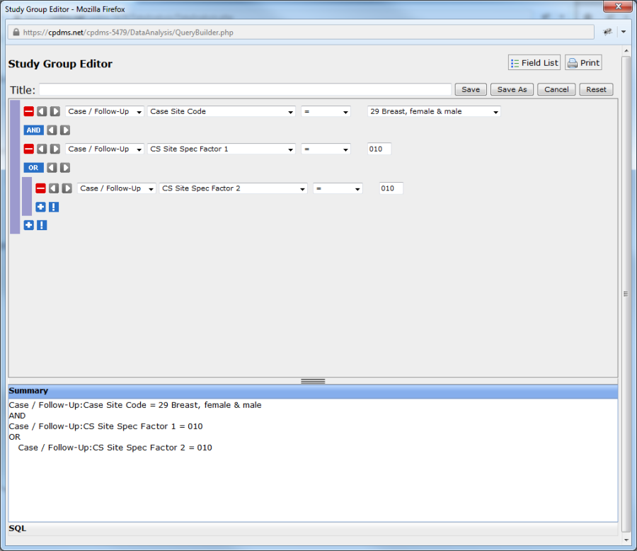
- Parentheses may be added to an expression by clicking the gray right arrow button to the immediate left of that expression. Clicking the gray left arrow button removes the parentheses. Clicking the arrow button to the left of an expression adds parentheses to that expression only. As seen in the example below, the expression "CS SSF2=010" is now in parentheses. This is indicated by a purple bar to the left of the expression, as well as the fact that the expression is now indented in the Summary.
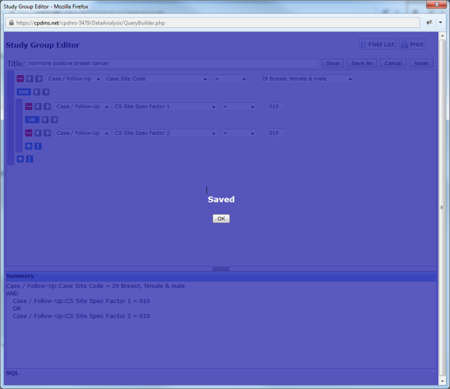
Additional selection criteria may be added until the query precisely describes all the characteristics of the records to be included in the study group. Once the query is completed, move the cursor to the blank box next to "Title." Type a relevant name for the study group and select the "Save" button to preserve the query. "Save As" is used to save changes made when editing a pre-existing study group without overwriting the original study group. The modified study group is saved as a new group. Selecting "Cancel" will abandon the query without saving it, while the "Reset" button removes all existing conditions, leaving the Study Group Editor blank.
The study group selection procedure described here used relatively simple examples of what is possible in CPDMS.net Data Analysis. A study group can actually be created with no selection criteria (in which case the resulting group contains every record in the database), or it may have a highly complex and precise set of criteria (i.e. females with
localized squamous cell carcinoma of the cervix, who were diagnosed after January 1st, 2004, who received surgery or radiation but not both, and who were eventually considered disease free). This level of specificity is all possible using the relational operators, Boolean operators, and parentheses.
If "Save" is chosen, CPDMS.net then displays a screen informing the user that the study group has been successfully saved. Click on the "Ok" button to return to the "Manage Study Groups" menu.
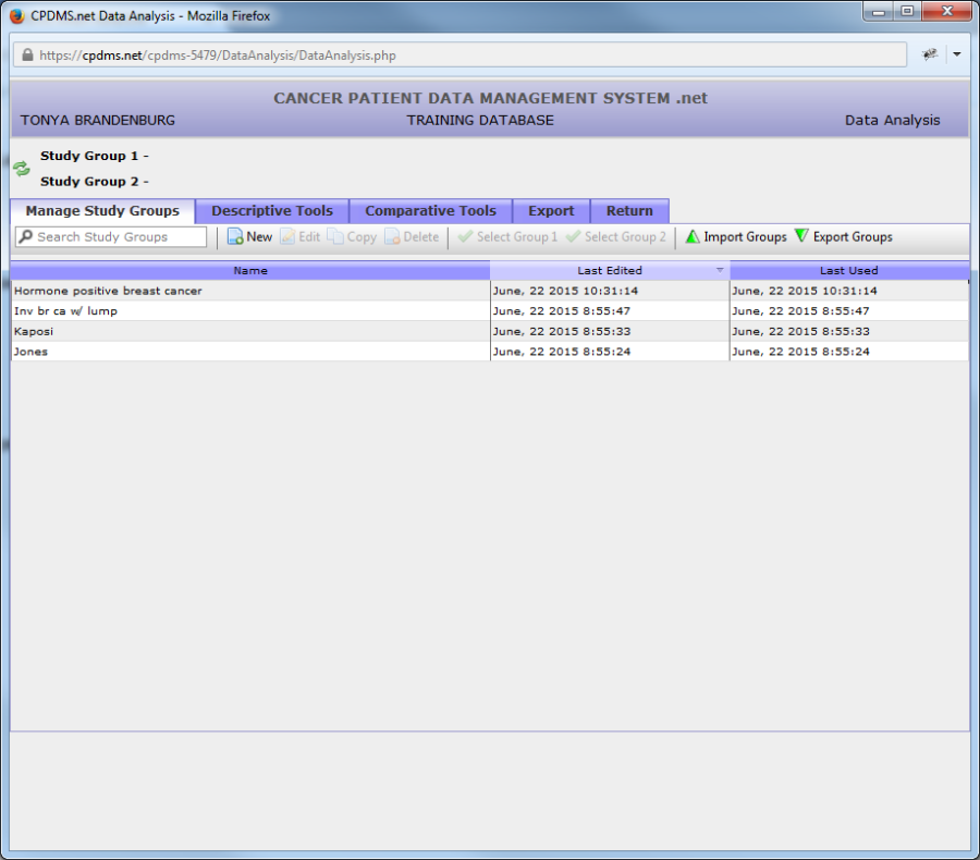
The newly created study group is now visible in the list of available study groups.
Edit a Study Group
An existing study group may be modified at any time by highlighting the title of the study and clicking the "Edit" button in the toolbar. In the example below, the study group "2005 Melanoma Cases" is highlighted.

When "Edit" is clicked, the study group opens in the Study Group Editor. Now conditions may be added, removed, or changed, and the study group may be renamed, if desired. When editing is complete, use the "Save" button to save the changes, or "Save As" to save this as a new study group without overwriting the original. "Cancel" to abandon without saving the changes.
Copy a Study Group
The next option on the toolbar is "Copy." This function allows a user to make an exact copy of a study group. The copy may then be edited and renamed. This feature is useful when creating several study groups which share many conditions, but differ in minor ways. To copy a study group, highlight that group and click the "Copy" button. The copied study group appears below the original. It has the same title and word "copy" in parentheses.
Delete a Study Group
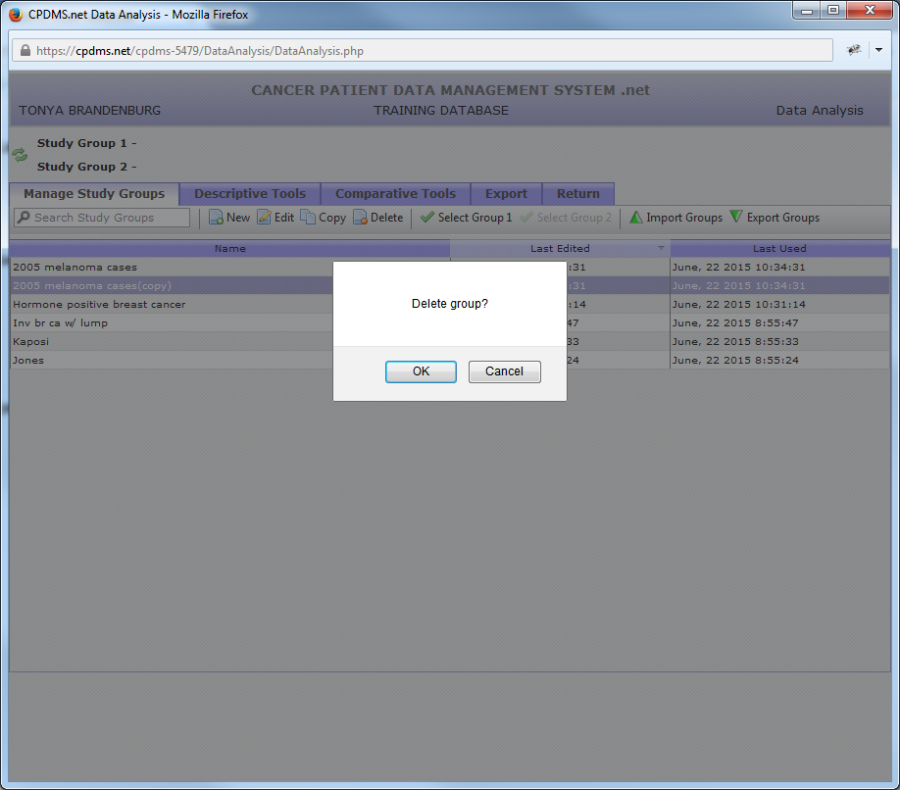
If a study group is created in error or is no longer needed, it may be deleted. To delete a study group, highlight that group and select the "Delete" button from the toolbar. A dialog box opens as a safeguard against unintentional deletion. Choose "Ok" to go ahead and delete the study group, or "Cancel" to keep it.
Select a Study Group
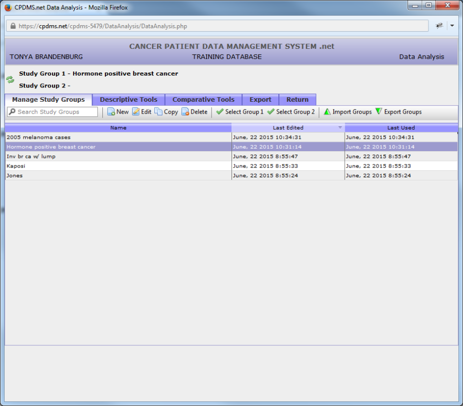
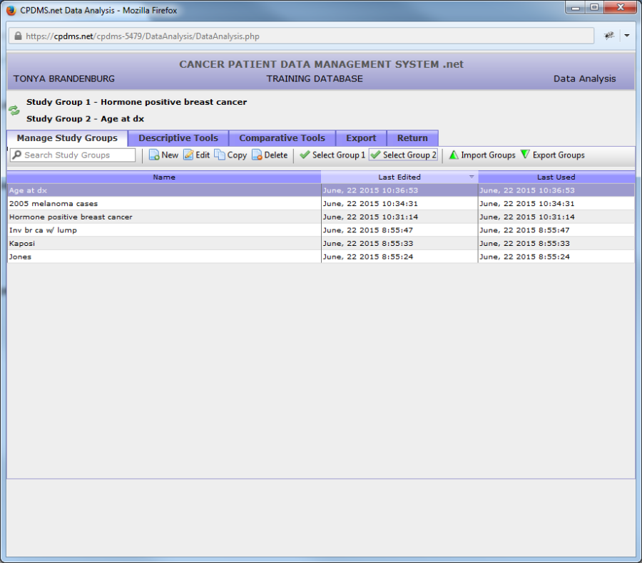
In order to select a study group for analysis, highlight the group and click "Select Group 1" from the toolbar. The title now appears next to "Study Group 1" at the upper left corner of the screen, indicating that it is the active study group (see below).
Follow the same procedure to select a second study group, but instead click "Select Group 2."
The study group in Group 1 is the active study group for all analysis tools except Comparative, which uses both Study Group 1 and Study Group 2.
The positions of the active study groups may be switched by clicking the ![]() button. Now "Age at dx" is selected as Group 1, and "Hormone positive breast cancer" is Group 2, as seen below.
button. Now "Age at dx" is selected as Group 1, and "Hormone positive breast cancer" is Group 2, as seen below.

In order to perform Data Analysis on a single study group, first select an active study group, and then click the "Descriptive Tools" tab. The following screen appears:

The Descriptive Tools menu shows the various statistical reports which are available. Briefly described, these are:
Count – generates a total count of the number of patient, case/follow-up, case other, case text, therapy, class history, or NAACCR therapy records in a study group.
Data List – an ordered list of the values found in specified fields for the records in the selected study group.
Stats and Graphs – these are mathematical calculations which provide a composite description of the selected study group on one or two particular variables. The descriptive statistic for categorical variables is the frequency count (and percentage) of the records in the group for each possible value of that variable. For example, the descriptive statistic for the variable "Sex" would be a count of the number of males and females in the study group. A full color bar chart graphing the percentage or count of study group records with each data value is available for categorical variables. The descriptive statistics for continuous variables are the total number of records involved in the calculation, the sum, the mean, standard deviation, and the minimum and maximum values. A full color histogram graphing the counts or percentages of records with values in specified ranges is also available for continuous variables.
Survival – this analysis includes a censored life table for a study group and graphs of the cumulative proportion surviving.
The following pages describe the precise steps to take to produce each of these reports.
Export/Import Study Groups
A study group may be imported or exported so that you can share information with others.
To Export:
You will see green triangles by import and export groups like in the image below. Once you have a study group created click on the Export Groups button on the Manage Study Groups page at the top right.
Once you click on the Export Group button the screen below pops up.
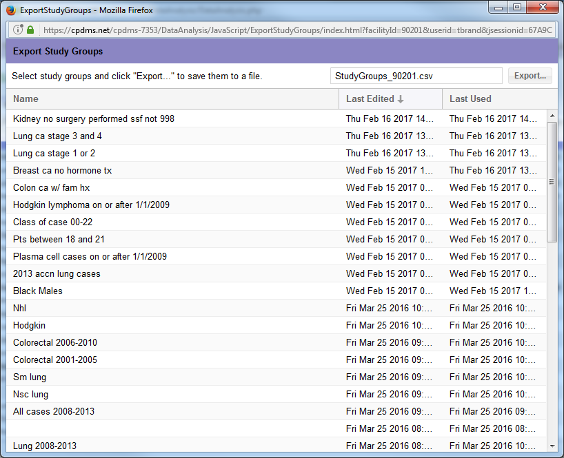
You can sort the groups by Name, Last Edited, or Last Used.
Click on the group you would like to export and then click the export button at the top of the page. This will bring up a pop up to open up the file or save the file in Excel.
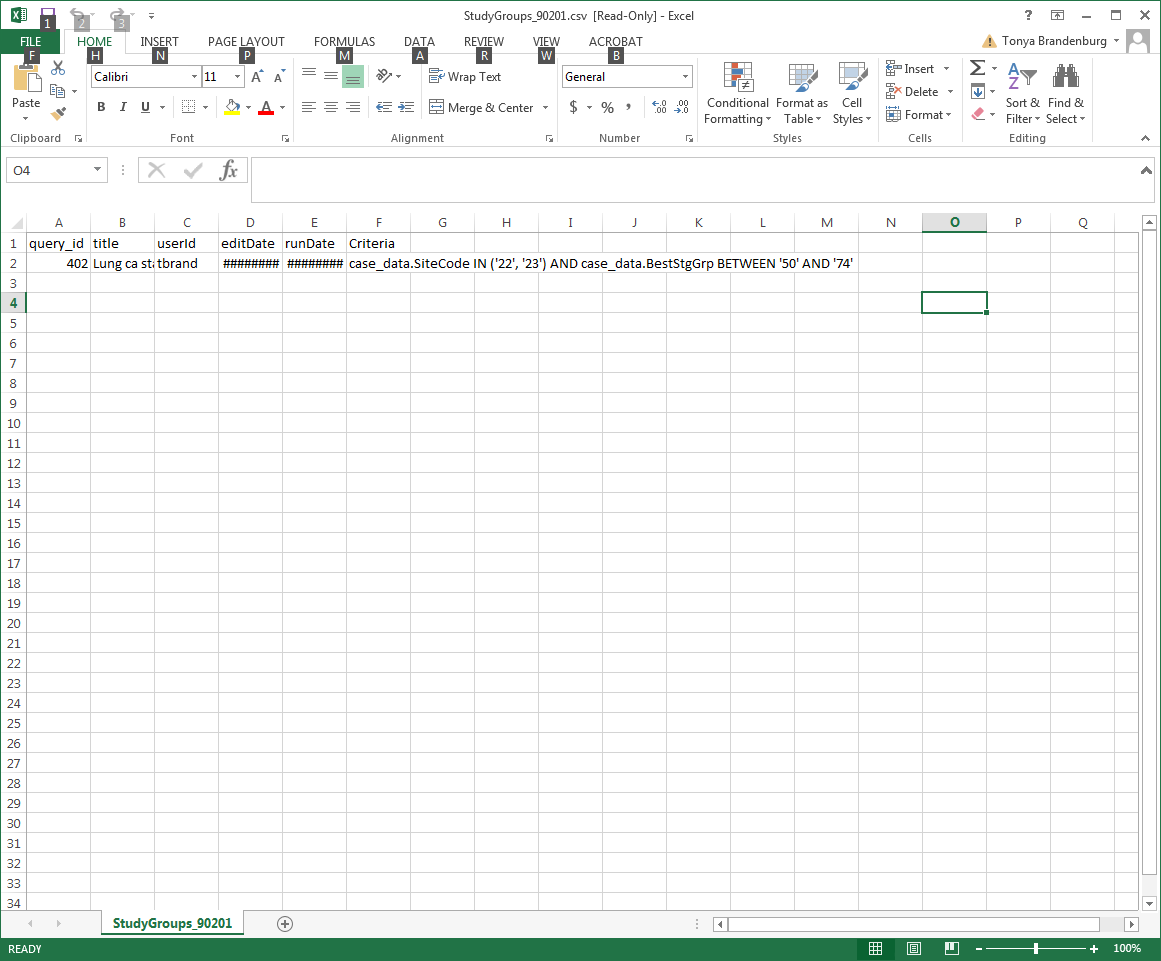
The query will be populated and be ready for you to email in Excel format for the next person to import.
To Import:
Save the excel file with the query on your computer.
Open up the Data Analysis function and the Manage Study Groups tab.
Click the Import Groups Button and the box below will open up.
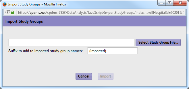
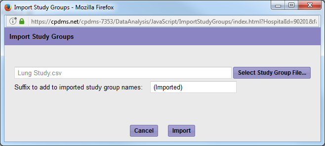
Click on Select Study Group File. Find the file that you previously saved on your computer and click open. Then click Import
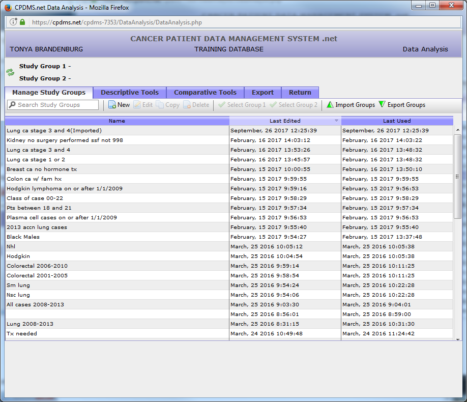
The newly imported study group will now show up on your Manage Study Group page as "(Imported)" as shown below.
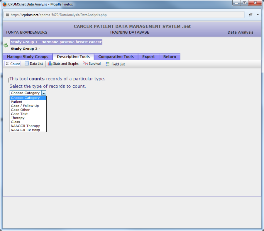
Count
Click on "Count" in the toolbar and a drop down menu appears. Users may choose Patient, Case/Follow-Up, Case Other, Case Text, Therapy, Class, NAACCR Therapy, or NAACCR Rx Hosp level records.
Once the record type to be counted has been specified, the count immediately appears, as seen below.
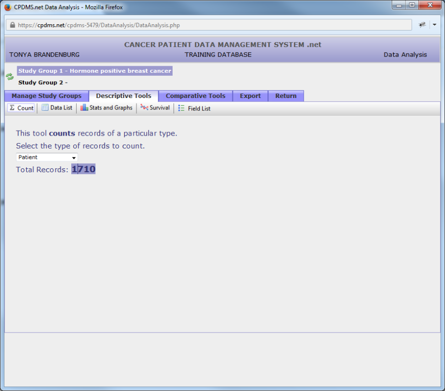
To see the count for a different type of record, simply open the drop-down menu again and choose the desired category. The count will instantly re-calculate and display the new total.
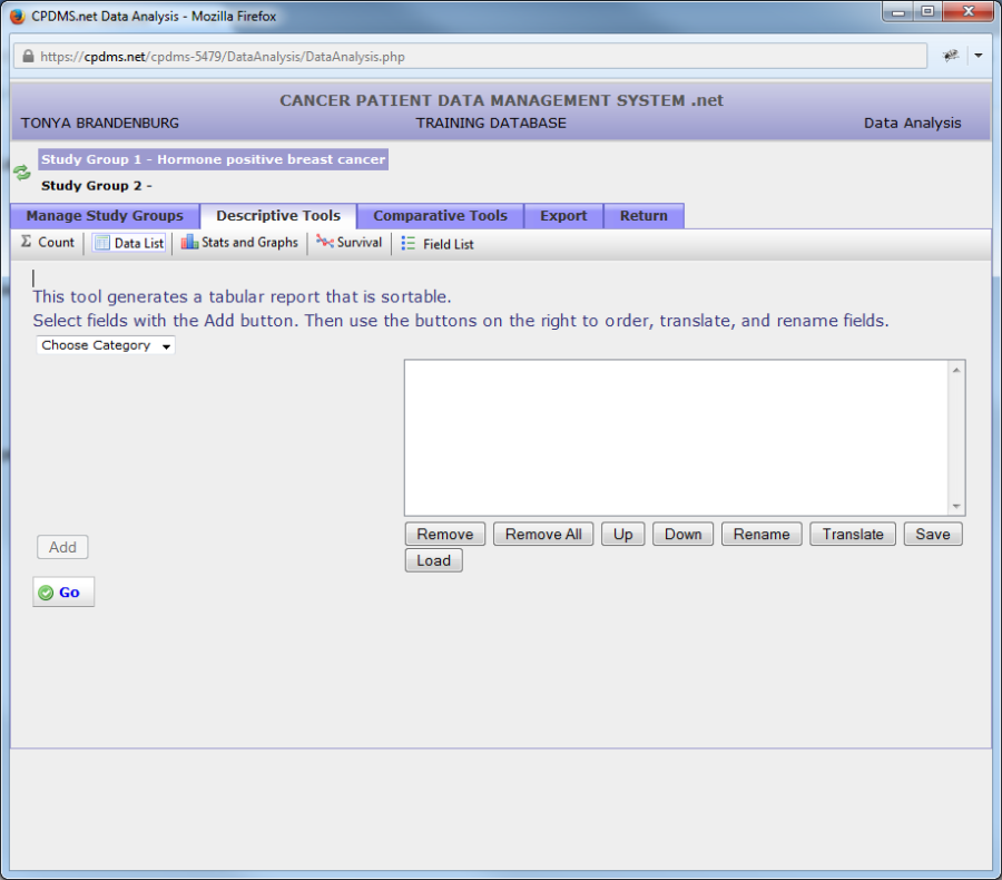
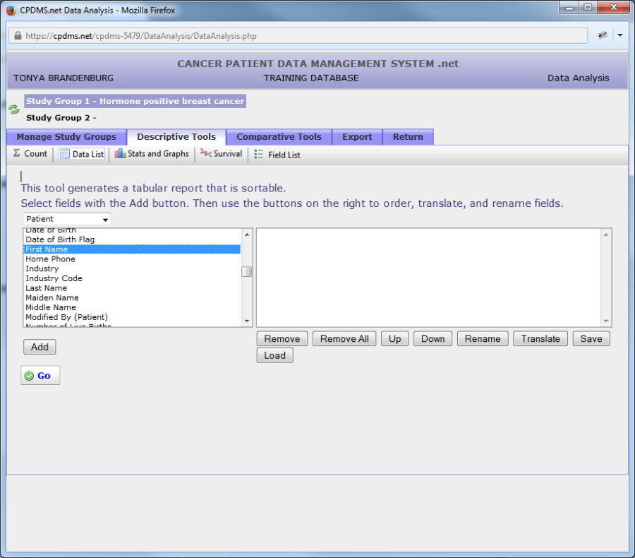
Data List
Click on "Data List" on the Descriptive Tools toolbar and the following screen appears.
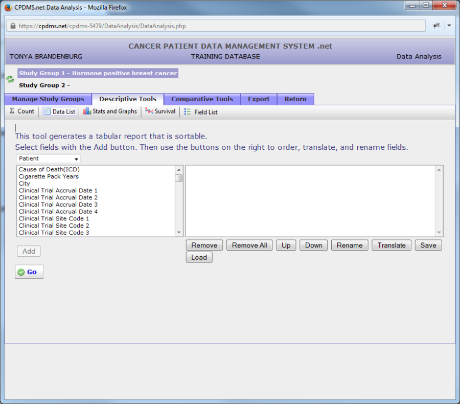
In order to choose the fields which will be included in the report, open the "Choose Category" drop-down menu. Choose the record level of the desired field.
To illustrate how to use this function, a sample Data List with the names, addresses, and primary following physicians of all hormone positive breast cancer patients will be created.
As soon as a category is selected, a list of all fields within that record level appears. In the example shown below, all Patient level fields are displayed.
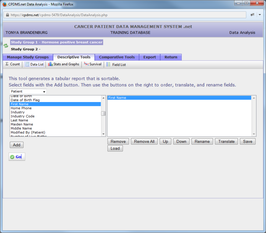
In order to include a field in the report, click on the field name to highlight it. Now click the "Add" button beneath the field list.
The field name (in this example, "First Name") is now displayed in the box on the right of the screen. Repeat this process to add more fields. There is no limit to the number of fields which may be added to the list; however, bear in mind that print settings may need to be altered to accommodate all the columns on a single page.
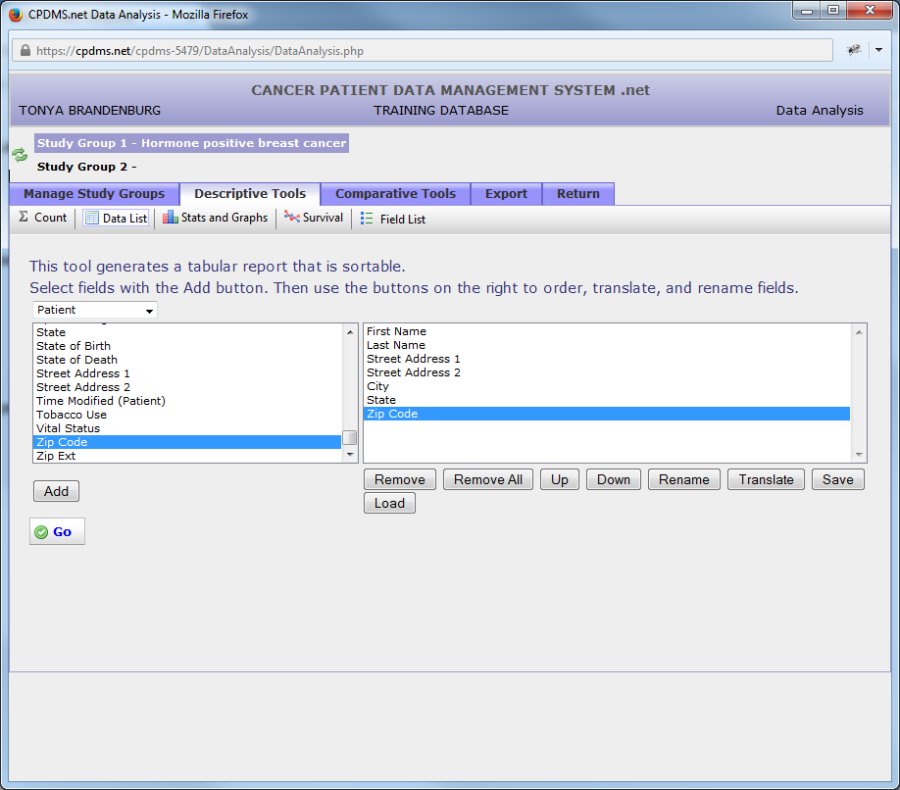
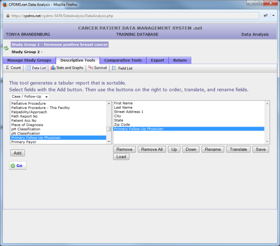
Now the data list consists of the fields First Name, Last Name, Street Addresses 1 and 2, City, State, and ZIP Code. These are all Patient level fields. To select Following Physician, a Case level field, open the category drop-down menu again and select "Case/Follow-up."
Now all Case/Follow-Up level fields are listed. As with field lists in the Study Group Editor, the cursor will jump directly to all fields beginning with a particular letter when that key is pressed while the cursor is in the list.
"Primary Follow-Up Physician" has now been highlighted and added to the data list.

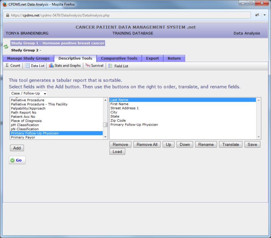
Several options are available for modifying the data list. Any of the fields which are listed may be removed by highlighting the field within the box and then clicking the "Remove" button. In the example below, "Street Address 2" has been removed.
The sequence of fields within the box determines the order in which columns containing values for those fields will be displayed in the data list report. For the example shown below, the data list report will have last name in the leftmost column, first name in the next column, etc. from left to right.
The order may be changed using the "Up" and "Down" buttons. To move a field, highlight it and then use "Up" to move the field closer to the top of the list (thus moving that column to the left in the resulting report), or "Down" to move it closer to the bottom (moving the column to the right). In the example below, the field "Last Name" has been moved to the top of the list.
Any field which appears in the data list may be renamed. Changing the name of a field can be useful for long names, in order to avoid having a very wide column heading. This does not change the name of the field anywhere else in CPDMS.net, only within the report being generated. Click on the field name to be changed, and then on "Rename."
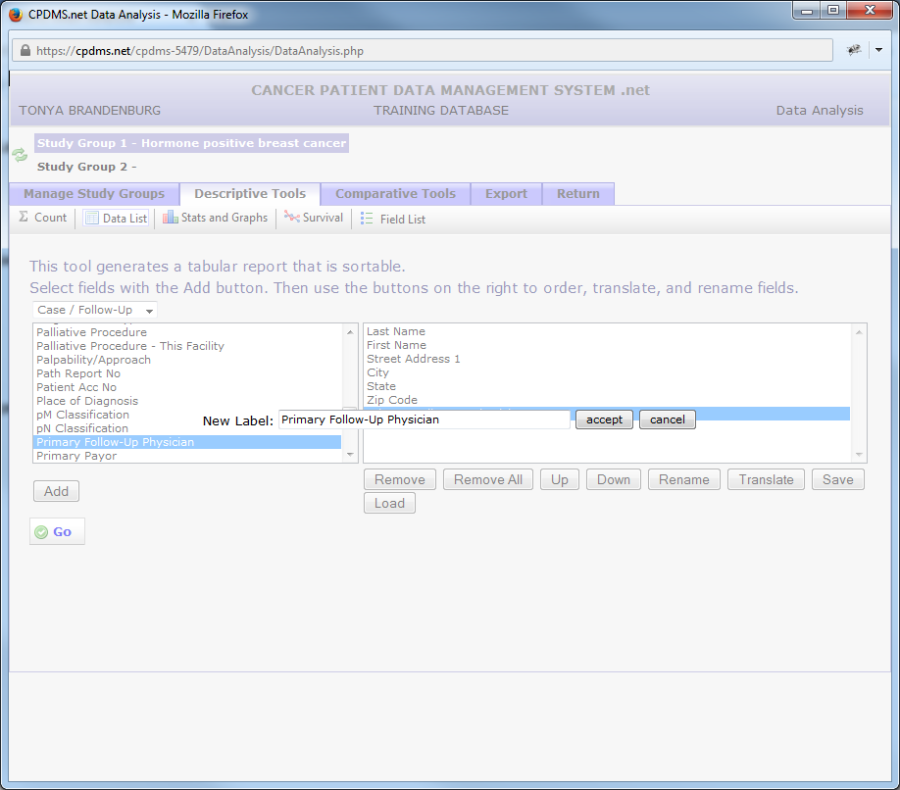
Now type the new label for the field. To save the label, click "Accept." To escape without making the change, click "Cancel."
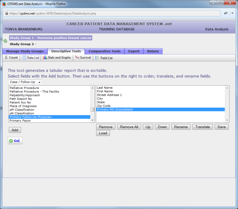
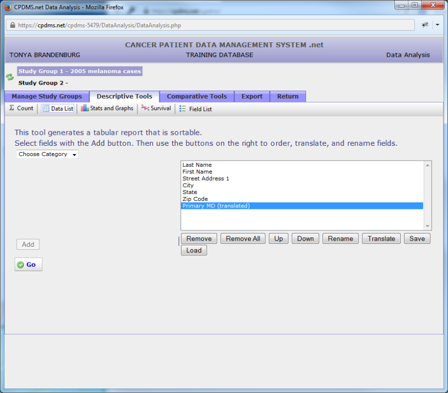
In this example, the label for the field "Primary Follow-Up Physician" has been changed to "Primary MD."

The default setting for field values in data lists is to appear un-translated. In this example data list, the field "Primary Follow-Up Physician" will display physician ID numbers rather than names. To show the translation of a field instead of its code, highlight the field and click "Translate." The word "translated" will now appear to the right of the field in parentheses and the field will be highlighted in purple. (See example below.)
Clicking "Translate" again while a translated field is highlighted will undo the translation. In order to display both the code and the translation for a particular field, add that field to the data list twice (this is done by simply clicking the "Add" button twice while the field is highlighted within the list). Once the field name appears twice in the data list box, highlight one instance and then click the "Translate" button. Now the field will appear on the resulting data list in two columns, one with the code and one with its translation.
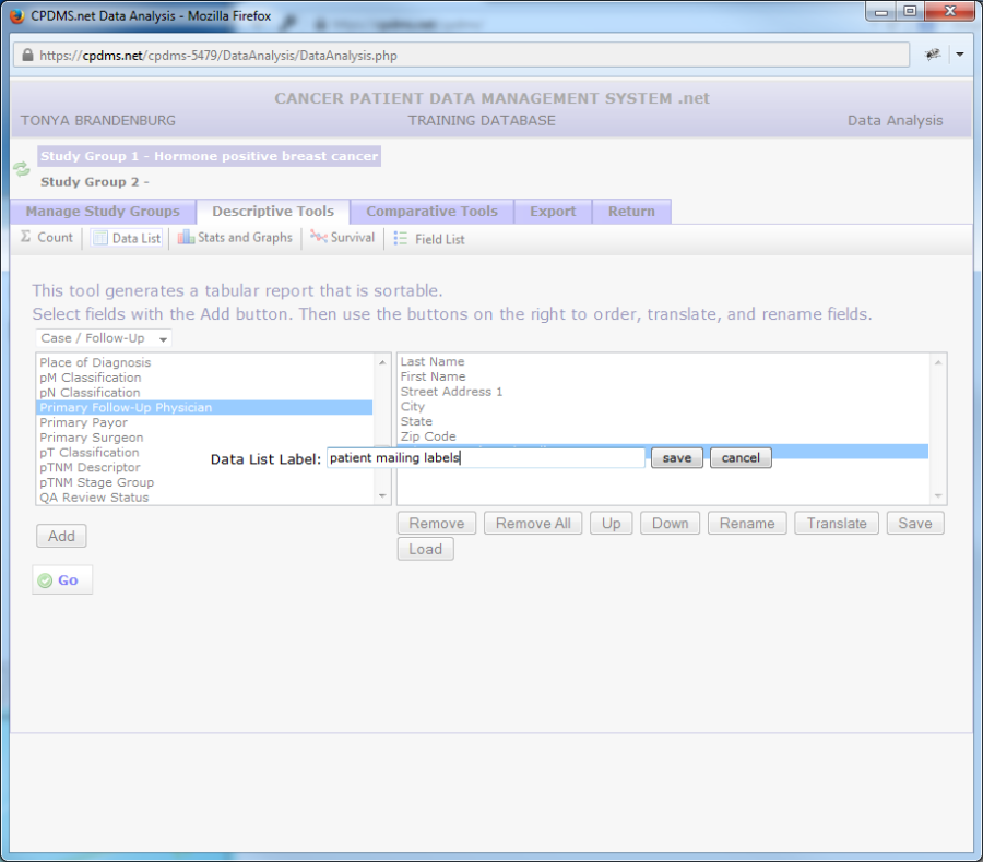
If a particular data list is likely to be used for many study groups (for example, a list of names and chart numbers), the list may be saved and then loaded for re-use at any time in the future. This eliminates the necessity of recreating the same data list over and over. In order to save a data list, click the "Save" button beneath the data list field box. The screen which appears prompts the user to enter a name for the current data list. Type a relevant title for the list and select "Save" to save it for later use. Choose "Cancel" to escape without saving. In the example below, the list will be saved as "patient mailing labels."
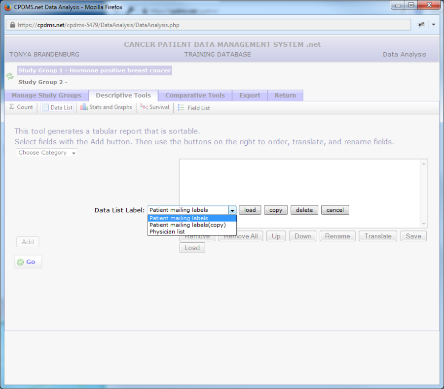
To use a list which has been saved, first make certain that the desired study group is selected as Study Group 1. Click the "Descriptive Tools" tab, "Data List," and then the "Load" button. A drop-down menu displays all saved data lists in alphabetical order.
Select a list and then click "Load" and the list will appear. Click the "Copy" button to create an exact copy of the data list. The list can then be loaded and modified. "Delete" permanently deletes a data list. Choose "Cancel" to escape this screen without loading a data list.
In the example below, the data list "Patient Mailing Labels" has been loaded for the study group "2005 melanoma cases."
To generate the data list report, click the "Go" button. The data list will open in a new window. (See example below.)
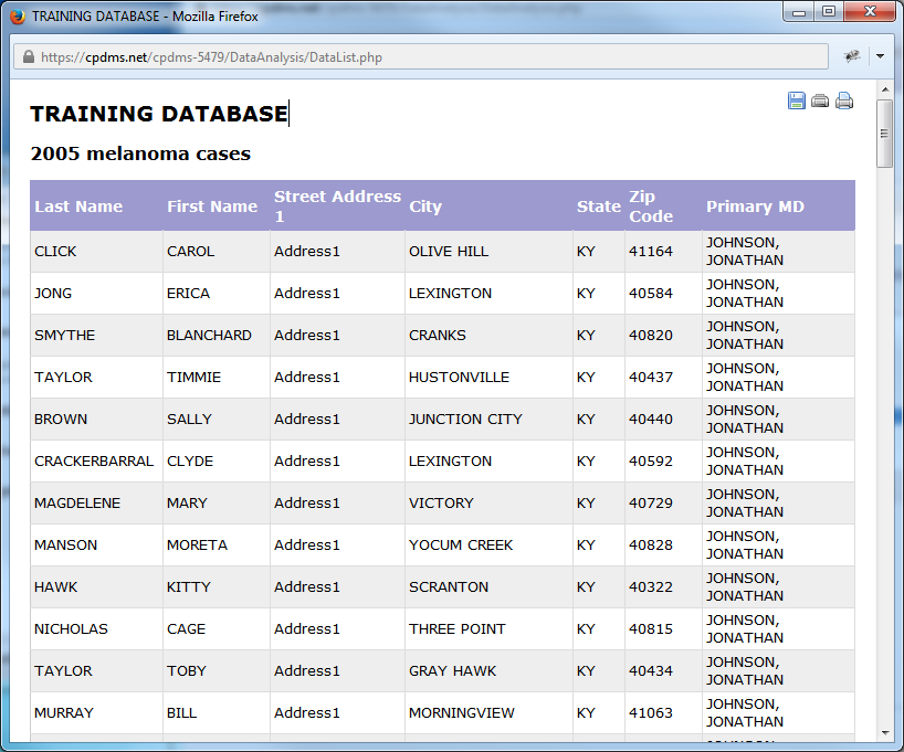
The institution name and the title of the study group are displayed at the top of the report. The fields listed may be re-ordered by clicking on any column heading. Clicking once orders that field in ascending order, while clicking a second time re-orders it in descending order.
Once a report has been generated, there are three options, illustrated by the icons in the upper right corner of the screen. Click the ![]() icon to save the report to a local computer or network drive. Choose the format (comma separated or pre-formatted), select a location, re-name the file (if desired), and save the file.
icon to save the report to a local computer or network drive. Choose the format (comma separated or pre-formatted), select a location, re-name the file (if desired), and save the file.
The next option is print preview. Click the ![]() icon to toggle between print preview and normal view.
icon to toggle between print preview and normal view.
The final option is print, represented by the ![]() icon. Clicking the print icon opens a dialog box which allows the user to select a printer, modify printer settings and preferences, and print the report.
icon. Clicking the print icon opens a dialog box which allows the user to select a printer, modify printer settings and preferences, and print the report.
To escape from the report and return to the Descriptive Tools menu, simply close the window.
Stats and Graphs
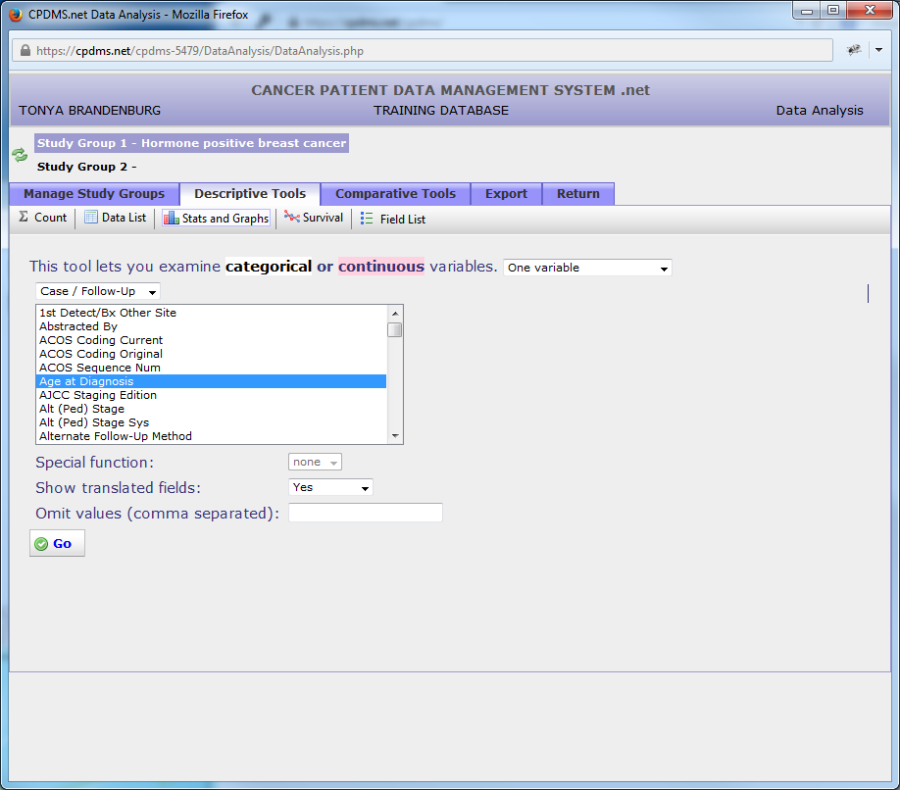
First select a study group to analyze. Click "Stats and Graphs" in the Descriptive Tools toolbar. The screen shown below will appear:
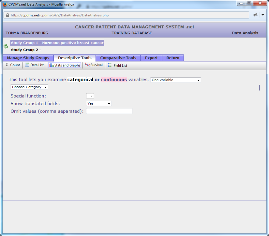
Users may choose to describe either one or two variables. As seen in the above example, the default is one variable. The following instructions will illustrate how to describe a single variable.
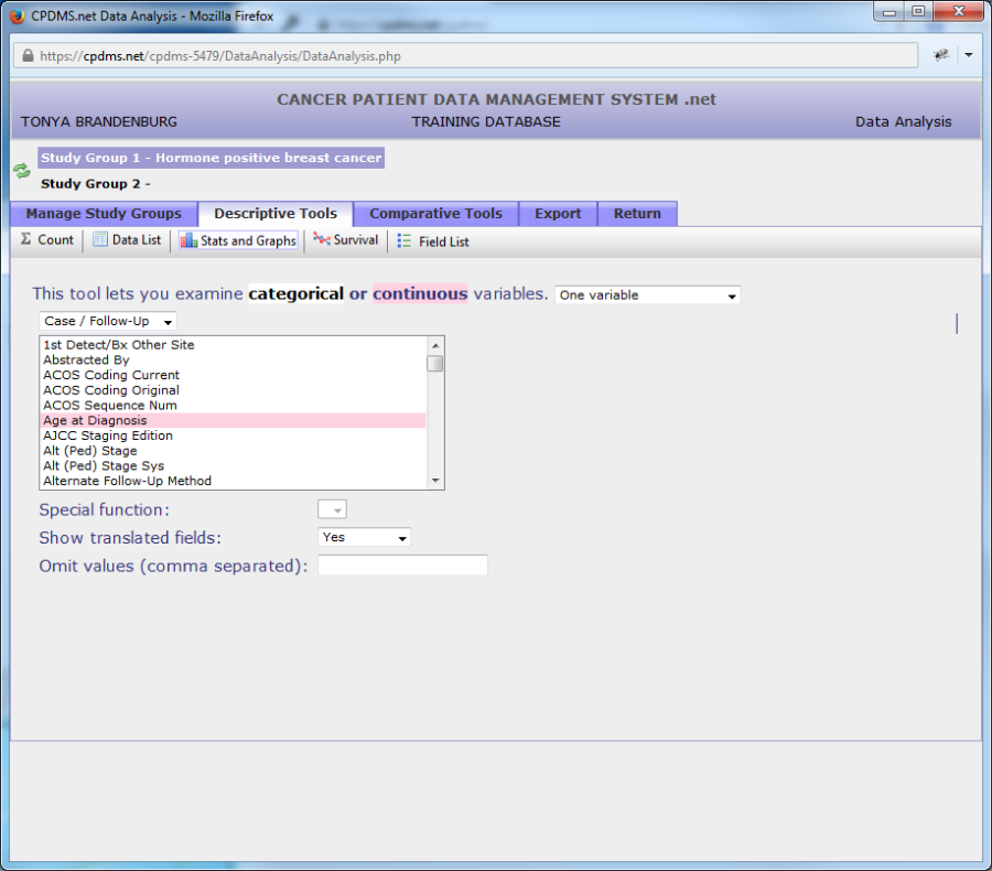
First select a data category from the drop down menu. In the example below, Case/Follow-Up level data is selected.
Next choose a variable to describe from the field list. All fields are either categorical or continuous variables. Categorical variables have discrete values which indicate a qualitative difference. An example is Sex, which can have one of five values (male, female, other, transsexual, or unknown). Continuous variables are numeric values which represent a quantitative difference, such as Age at Diagnosis. In the list of available fields, categorical variables are white, while continuous variables are indicated by pink highlighting.
Once a variable has been selected, further options are available. If the field chosen is a date field (for example, Date of Diagnosis), the "Special Function" option allows the user to display only the year instead of the full date. Use the next drop-down menu to choose whether to show only the translated field description, only the un-translated code, or both. Users may also specify certain values to exclude from analysis. In the example below, typing '99' in the "Omit Values" field will exclude any cases with an unknown best stage group. Some fields have a default value excluded. For example, if Race1 is selected, '99' is automatically filled in the "Omit Values" field. However, the default value can be removed if a user wishes to include that value in analysis. If more than one value is to be omitted, each should be separated by commas. Blanks may be excluded by typing a set of empty single quotation marks ('').
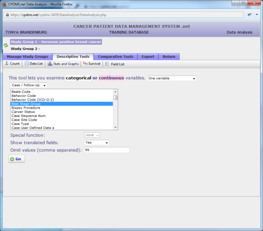
Click the "Go" button to generate the descriptive report. Like the Data List report, the result will open in a new window (see below).
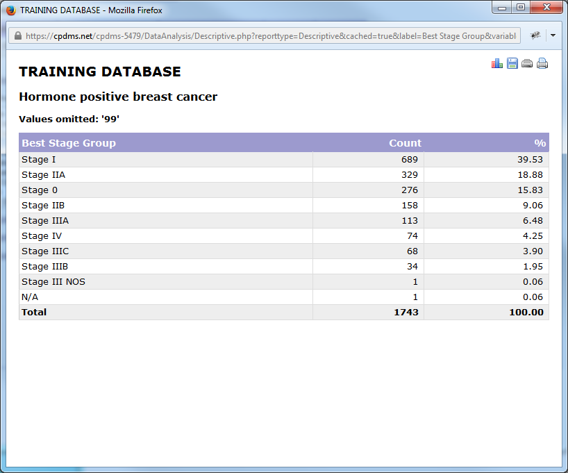
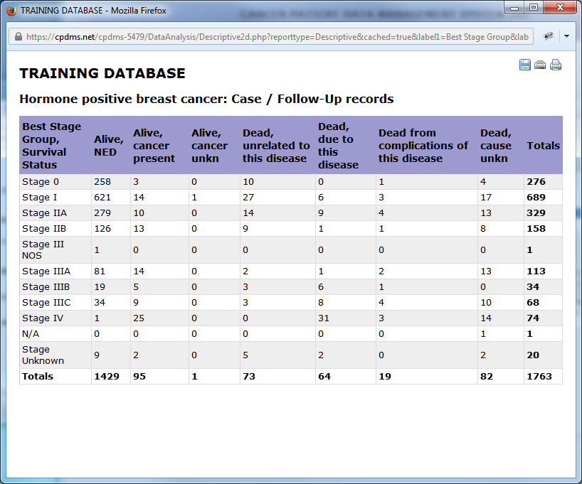
The institution name, study group title, and a list of any values which were omitted are shown at the top of the report. The descriptive statistic for a categorical variable such as Best Stage Group is a frequency count (and percentage) of the number of cases in the study group having each of the possible values for this variable. The default order is by percentage, but the report may be re-ordered by clicking on any column heading. Click once for ascending order and twice for descending order.
Icons in the upper right portion of the report represent the various options available for manipulating the results: generate a graph, save, print preview, or print.
Clicking the ![]() icon will generate a bar chart (for a categorical variable) or a histogram (for a continuous variable). Seen below is an example using the categorical variable Best Stage Group. The Graph Editor opens in a new window:
icon will generate a bar chart (for a categorical variable) or a histogram (for a continuous variable). Seen below is an example using the categorical variable Best Stage Group. The Graph Editor opens in a new window:
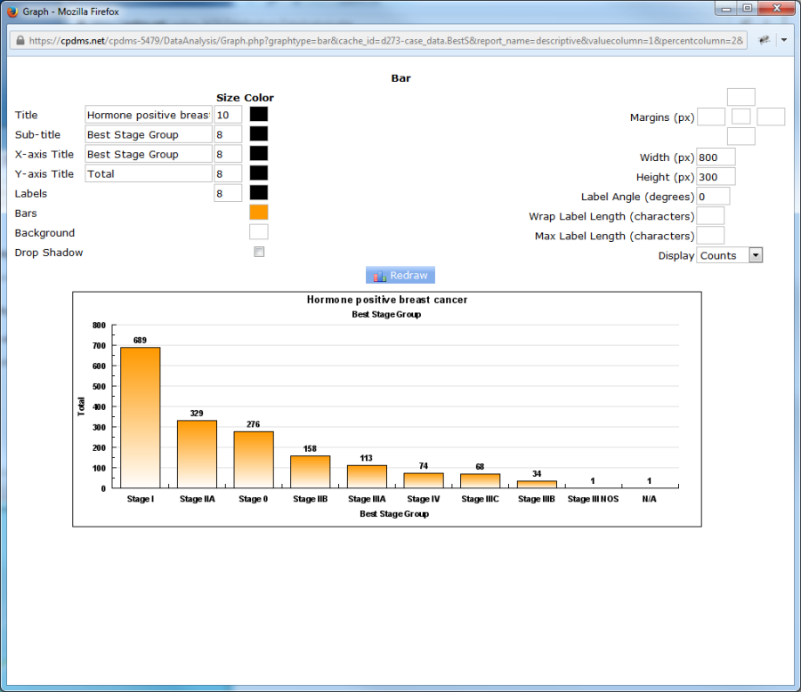
The graph appears with default settings, but users may specify the appearance of various components of the graph. The title of the graph is the study group name, and the sub-title is the name of the variable being described. However, either may be re-named by overwriting the default names. The X and Y axis titles may also be re-named. Font sizes may be increased or decreased by typing a new point size over the default value. Users may specify the colors for the Title, Sub-title, X and Y axis Titles, Labels, Bars, and Background.
To choose a color, click on the box in the "Color" column which corresponds to the graph element to be modified. A palette pops up which allows the user to choose from among 70 colors. Click on the desired color and the screen returns to the Graph Editor. The color which was selected is shown in the box. In the example below, the box corresponding to "Background" indicates the color (green) the background will appear in the graph.
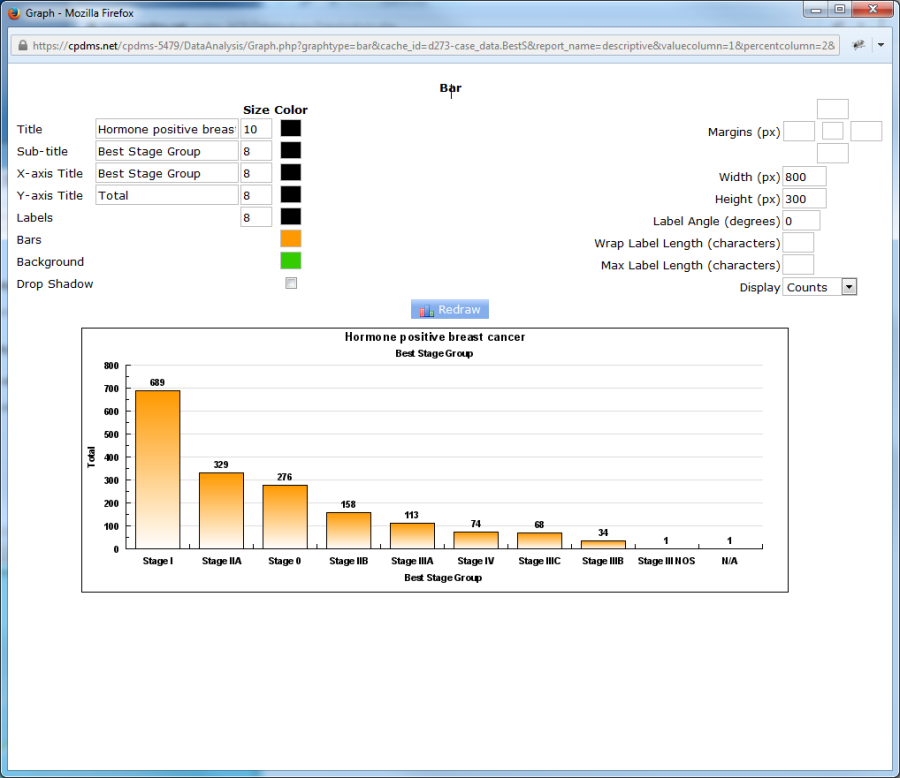
Click the "Redraw" button to display the graph with the changes which were made.
Now the background of the graph is green. A graph can be altered and re-drawn as many times as necessary to achieve the desired result.
Click the box to the right of the element "Drop Shadow" to create a shadow effect for the graph. The margins of the graph (in pixels) may be changed by typing a value in any of the four boxes (representing the top, right, bottom, and left margins) in the upper right corner of the screen. The empty box in the center allows users to choose the margin color. These boxes may be left blank to retain the default margin values. Users may also specify the width and height of the graph in pixels. For example, a graph which has many labels along the X axis may need to have the width increased to improve its appearance.
Label Angle allows users to change the orientation (in degrees) of the bar labels. In the example seen below, the labels are angled at 45 degrees.
Field codes which are several words long when translated can be wrapped in order to improve their appearance. The element Wrap Label Length stipulates the maximum number of characters which can be in one line of the label. When the number of character exceeds this length, the label text wraps to the next line. See the example below using the field Survival Status.

The element "Max Label Length" specifies the length (in number of characters) of the bar labels. Leave this element blank to display the entire label, regardless of length. Finally, users may choose to construct the bar graph with either counts or percentages by using the drop-down menu to the right of the element "Display." The Y-axis of bar graphs show counts by default.
The graph may be saved by right-clicking on the image and selecting "Save Image As."
A dialog box opens which allows the user to choose a location in which to save the image. By default, the image is saved as a Bitmap (*.bmp) file.
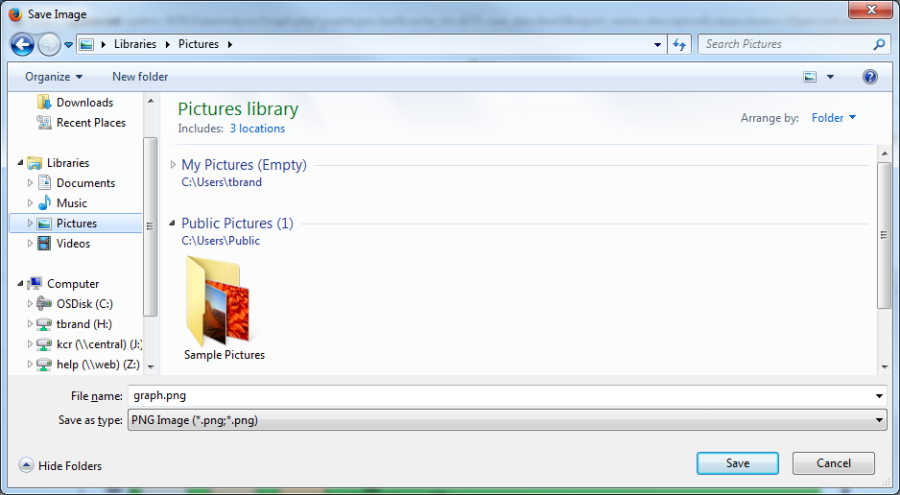
After choosing a location, type an appropriate name for the file and save it. The image may now be inserted into a Word or PowerPoint document, inserted into an Excel spreadsheet, printed, or manipulated using programs such as Microsoft Paint.
To escape from the Graph Editor, simply close the window and the screen returns to the report.
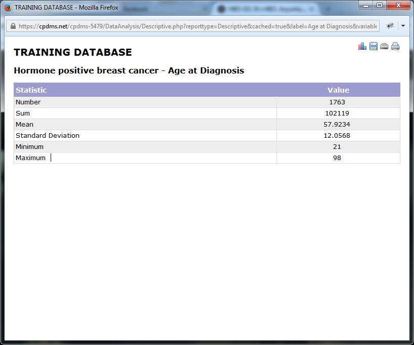
For an example of descriptive statistics using a continuous variable, the same study group will be analyzed by describing the variable Age at Diagnosis.
As before, the institution name appears at the top of the report, followed by the study title and field being described (any values which were omitted will also be listed here). The descriptive statistics for a continuous variable are given: the number of records, the sum of the values, the mean, the standard deviation, and the minimum and maximum values for this study group.
Click on the graph icon in the upper right corner to create a histogram.
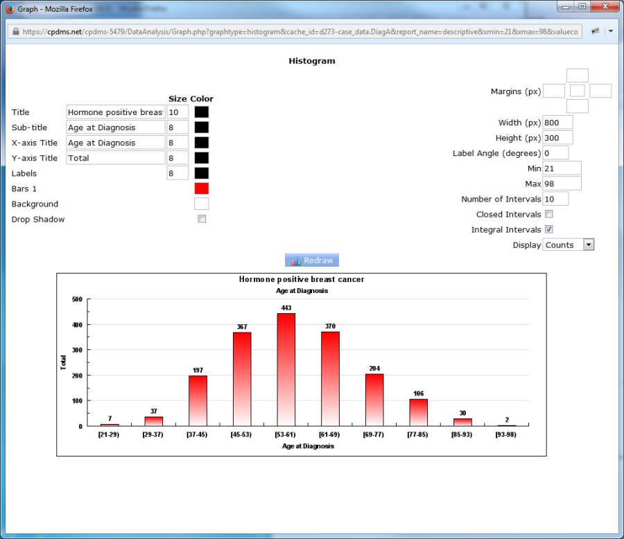
The histogram appears with default values, but as with bar graphs, these may be modified by the user. The graph elements on the left side of the screen (Title, Sub-title, X and Y axis Titles, Labels, Bars, Background, and Drop Shadow) are identical to the options available for bar graphs. Font size and color may be modified, or the default values may be retained. On the right side of the Graph Editor, the elements Margins, Width, Height, and Label Angle are also the same. However, there are five elements which are unique to histograms. Minimum and Maximum determine the range of values shown on the X axis. The default values are the actual minimum and maximum from the descriptive report, but these can be overwritten with other values.
Number of Intervals determines the number of bars in the histogram. The default for this element is set at ten intervals, but this may be overwritten. The number of intervals will determine the value range represented by each bar in the histogram. For example, if Minimum and Maximum are zero and one hundred, respectively, and Number of Intervals is ten, then each bar will correspond to a value range of ten. (See below.)
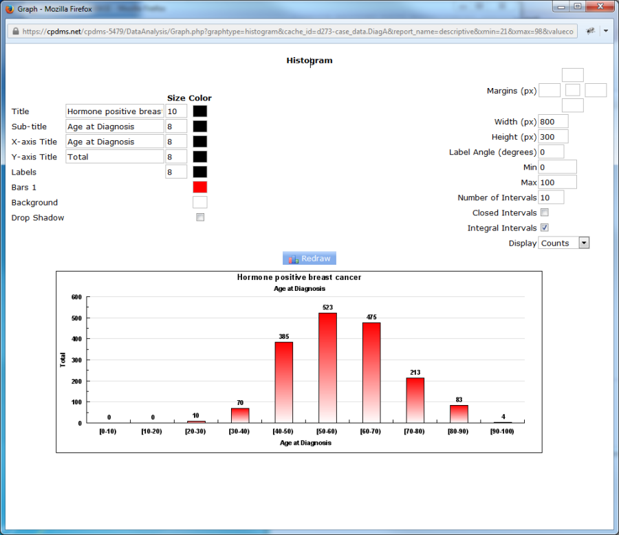
Next is the element "Closed Intervals." When an interval between two numbers is closed, this indicates that the upper boundary is included in the range. An open interval is one in which the upper boundary is not included within the range. The default setting for histograms is open intervals. So in the above example, the range 30-40 includes the values 30 through 39.99, but not the value 40. A forty-year-old in this study group would be included in the 40-50 range.
Click the "Closed Intervals" box to change this setting.
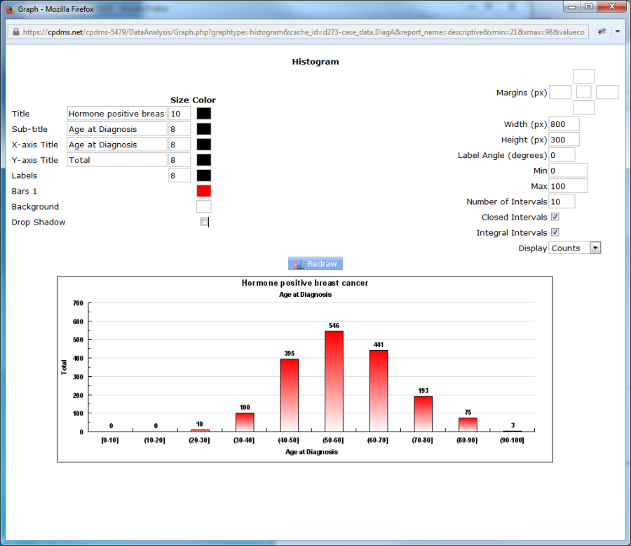
Observe that the histogram has changed. Now the interval 30-40 includes the value 40, so the forty-year-old is encompassed within that range.
When Integral Intervals is checked (the default setting), the ranges on the X axis of the histogram are shown as integers, as seen above. When Integral Intervals is unchecked, the range endpoints are displayed with up to two decimal places.
The final element of a histogram is Display, which allows users to choose between displaying counts or percentages on the Y axis.
In order to describe two variables, choose "two variables (cross-tab)" from the drop- down menu.
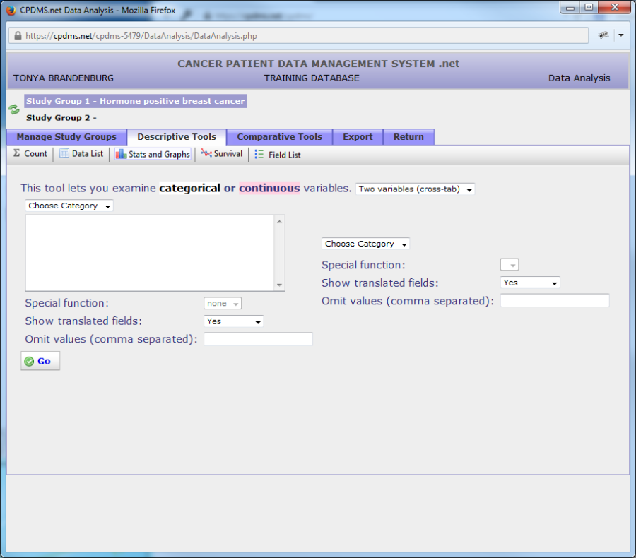
Users may now select two different variables from the "Category" drop-down menus, using the same method described in previous pages. However, there is an important difference when describing two variables as opposed to one-- only categorical variables can be described. Continuous variables cannot be described when more than one variable is involved. As before, users may choose whether to translate field descriptions and specify any values which are to be omitted.
When the report is generated, the variable on the left will be displayed in rows, and the variable on the right will be displayed in columns. Users may wish to put the variable which is likely to have the most values on the left, in order to ensure that the resulting report isn't too wide to easily view and print.
In the example shown below, the variables "Best Stage Group" and "Survival Status" will both be described.
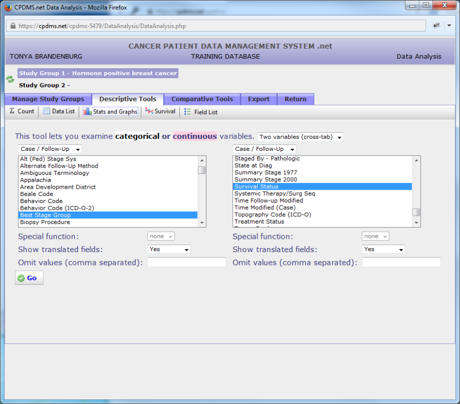
As with a single variable, click "Go" to generate the report.
The result is shown below. Note that unlike reports describing a single variable, these reports cannot be sorted by column.
One final significant difference when describing two variables is that these cannot be represented graphically. However, the reports may be saved or printed in the same manner as other data lists and descriptive reports.
Survival
The survival analysis calculated by CPDMS.net uses the actuarial, or life-table, method for determining survival rates. This method provides a means for using all follow-up information accumulated up to the closing date of the study. The actuarial method has the advantage of providing information about the manner in which the patient group was depleted during the total period of observation. The life table is "censored" monthly-- that is, cases which are lost to follow-up, deceased due to other causes, or too recently diagnosed to have survived beyond this interval are withdrawn. Thus, the proportion of patients dying due to this cancer is based only on the number of patients who were exposed to the risk of dying.
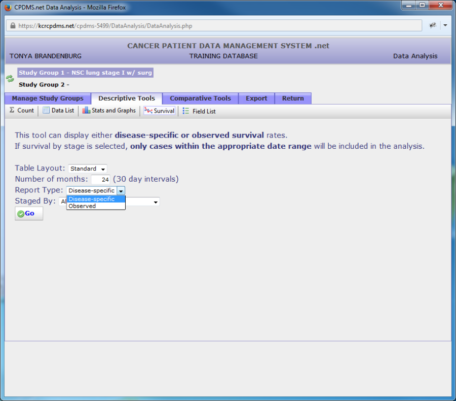
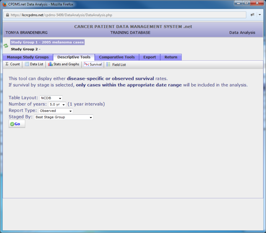
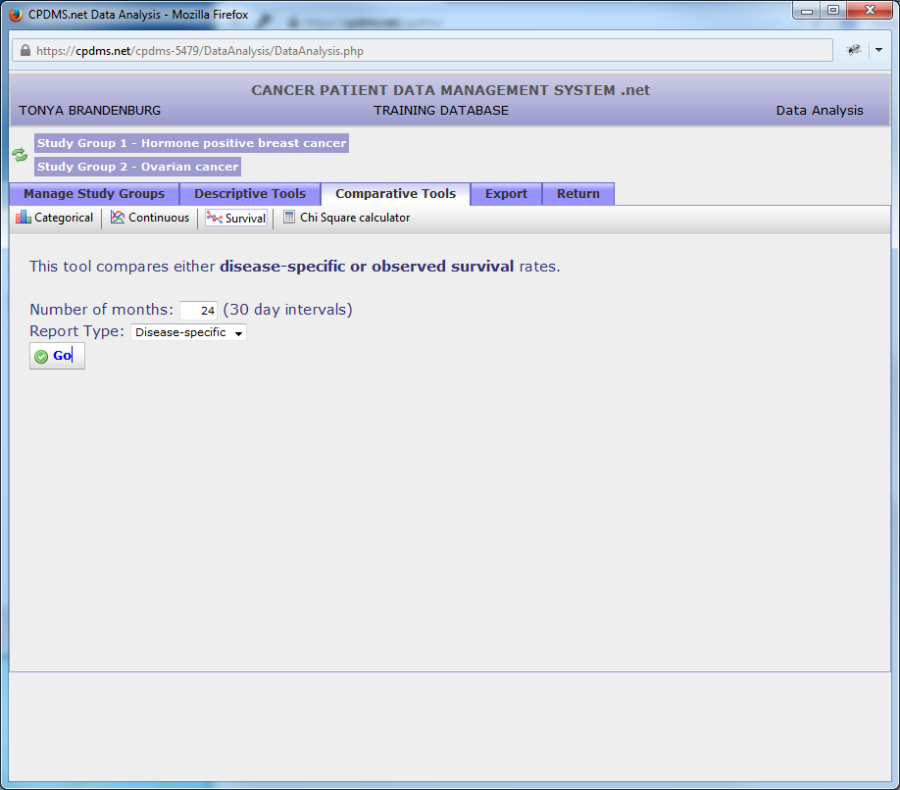
In order to perform a survival analysis, select a group as Study Group 1 and click the "Descriptive Tools" tab. Now click "Survival" in the Descriptive toolbar. (See example below.)
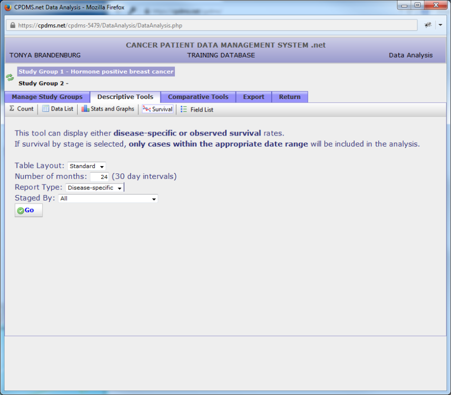
In this screen, users may specify the table layout and length of the study in months. The default length of study value is twenty-four months. You may choose the report type by "Disease-specific" or "Observed."
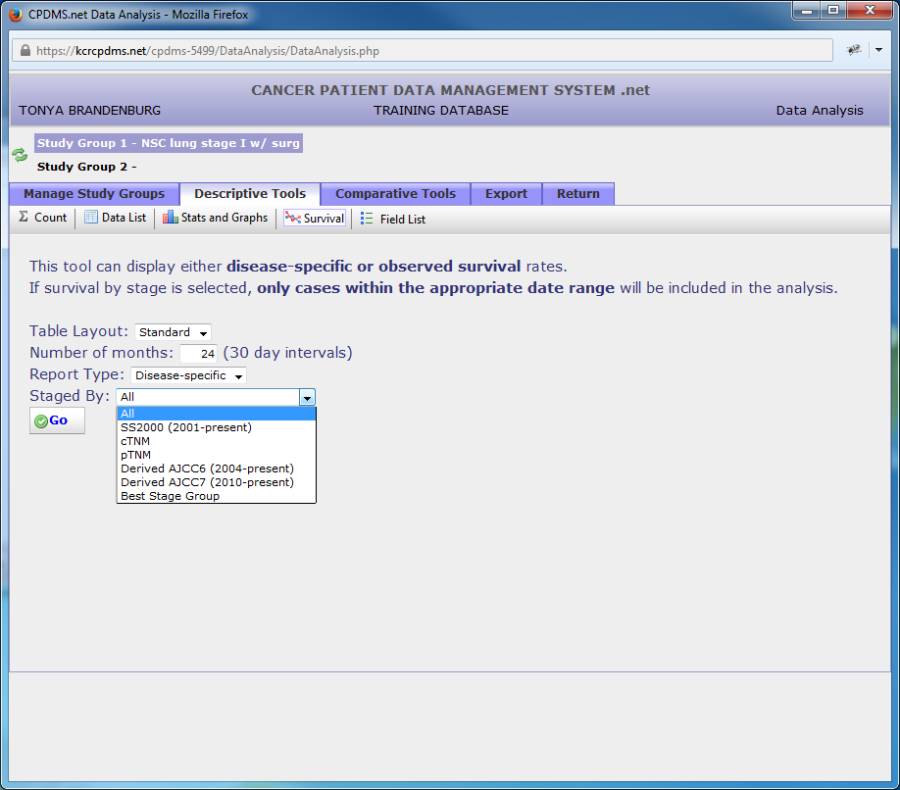
Disease-specific shows deaths only related to the disease chosen, while observed records all deaths. You can also choose "Staged By." Click "Go" to generate the survival report. 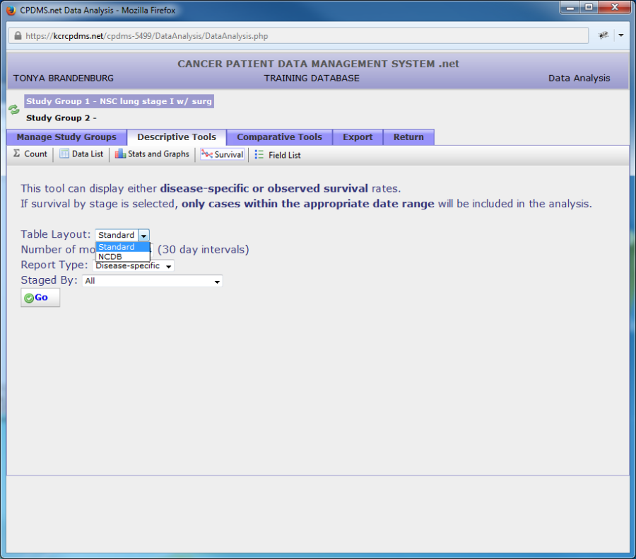
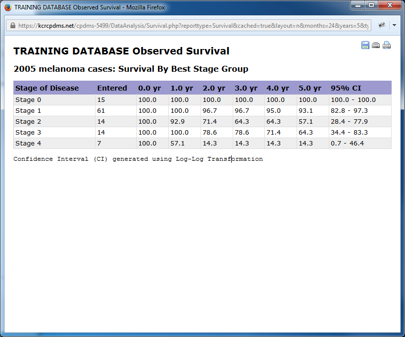
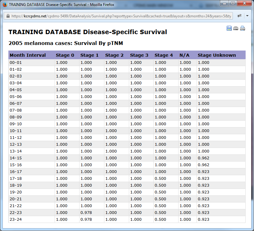
Below is an example table for the study group "NSC lung stage I w/Surgery" for a sixty month period using a disease-specific report. For each monthly interval, the life table displays the number of cases entering that time period, the number withdrawn during that month, the resulting number exposed to the risk of dying during that month, and the actual number of patients who died due to cancer that month. From these figures, the proportion dying, the proportion surviving, and the cumulative proportion surviving are calculated. Finally, in the last column, the standard error of the mean is calculated using the Greenwood formula. This is useful for measuring the extent to which sampling variation influences the computed survival rate.
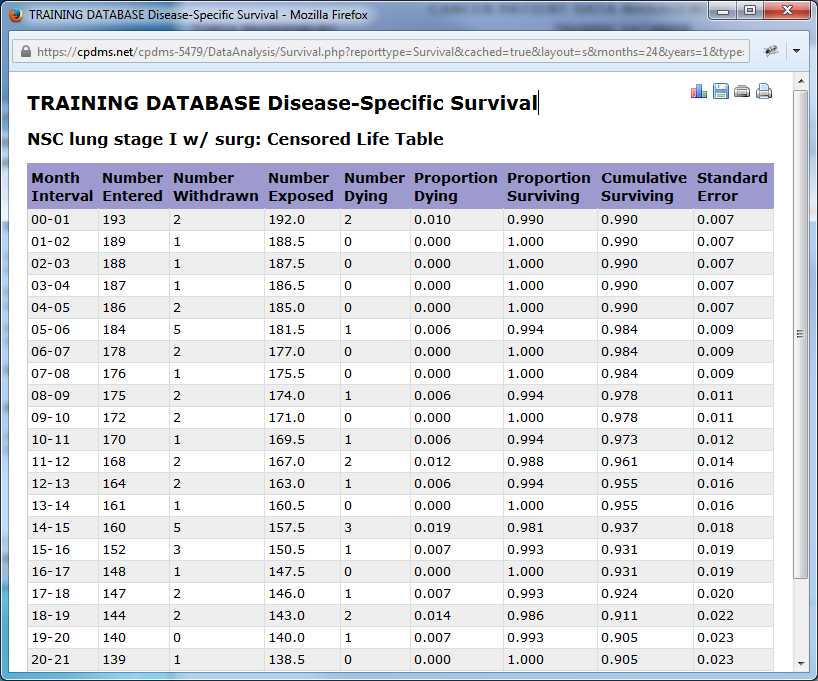
Use the icons in the upper right corner of the report to print the table or save it. Click the ![]() icon to generate a plot of the cumulative proportion of surviving patients.
icon to generate a plot of the cumulative proportion of surviving patients.
When a user clicks the graph icon, the Graph Editor opens in a new window (see below).
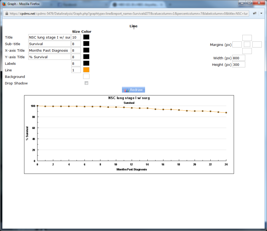
A default plot is generated, but users may modify specific elements of the graph. The default title is the name of the study group being examined, and the default sub-title is "Survival." The X- and Y- axis titles are "Months Past Diagnosis" and "% Survival," but any of these may be overwritten. In the "Size" column, the font size of each title may be specified. Click on the empty box in the "Color" column to the right of a particular element to choose a color from a palette of 70 colors. Click the box to the right of "Drop Shadow" to create a shadow effect for the graph. The four boxes to the right of "Margins" allow the user to specify the top, right, bottom, and left margins (in pixels).
Click the empty box in the middle to choose a margin color. The width and height of the graph may also be adjusted, or leave the default values in place. Click "Redraw" to generate the graph after making changes.
Right-click the graph and choose "Save Picture As" to save it as a Bitmap image file. To escape the Graph Editor, simply close the window.
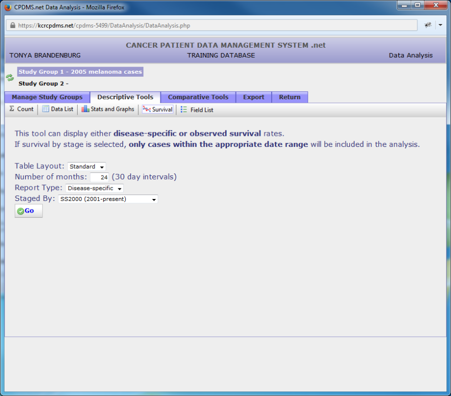
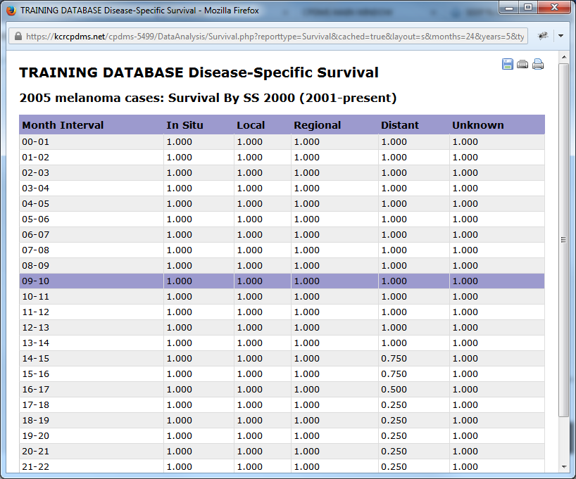
Below are examples of survival analysis using different combinations of table layout, report type, and staged by categories.
Field List
Using this option will create a printer-friendly list of all fields available for data analysis is also available from this menu by clicking on the "Field List" button in the toolbar.
Comparative Statistics
Using this option, the characteristics of two different study groups may be compared for any variables, as well as for survival. The appropriate statistic is automatically calculated, depending on whether the variable selected for analysis is categorical or continuous. A Chi Square is performed on categorical variables; a means test (t or z test) is applied to continuous variables. Bar charts and histograms showing both groups on one graph are available with comparative statistics.
The comparative statistic for categorical variables is a Chi Square, which measures the difference in the proportion of each group having each of the possible values for the variable under study. The comparative statistic for continuous variables is a z test (or a t test), which measures the difference between two group means for the variable under study. Comparative statistics also provide the probability range for the likelihood that the difference between the two groups being studied is due to random chance, rather than some causative factor.
The probability that the difference between the two groups is statistically significant is also calculated and displayed.
In very general terms, probability can be interpreted as follows:
- If P is greater than 10% (P>.10), then no statistically significant difference exists between the two groups for the variable being compared.
- If P is less than 10% but greater than 5% (.05<P<.10), then the two groups are approaching a statistically significant difference for the variable being compared.
- If P is less than 5% but greater than 1% (.01<P<.05), then there is a statistically significant difference in the variable being compared between the two groups.
- If P is less than 1% (P<.01), then there is a highly significant statistical difference between the two groups in the variable being compared.
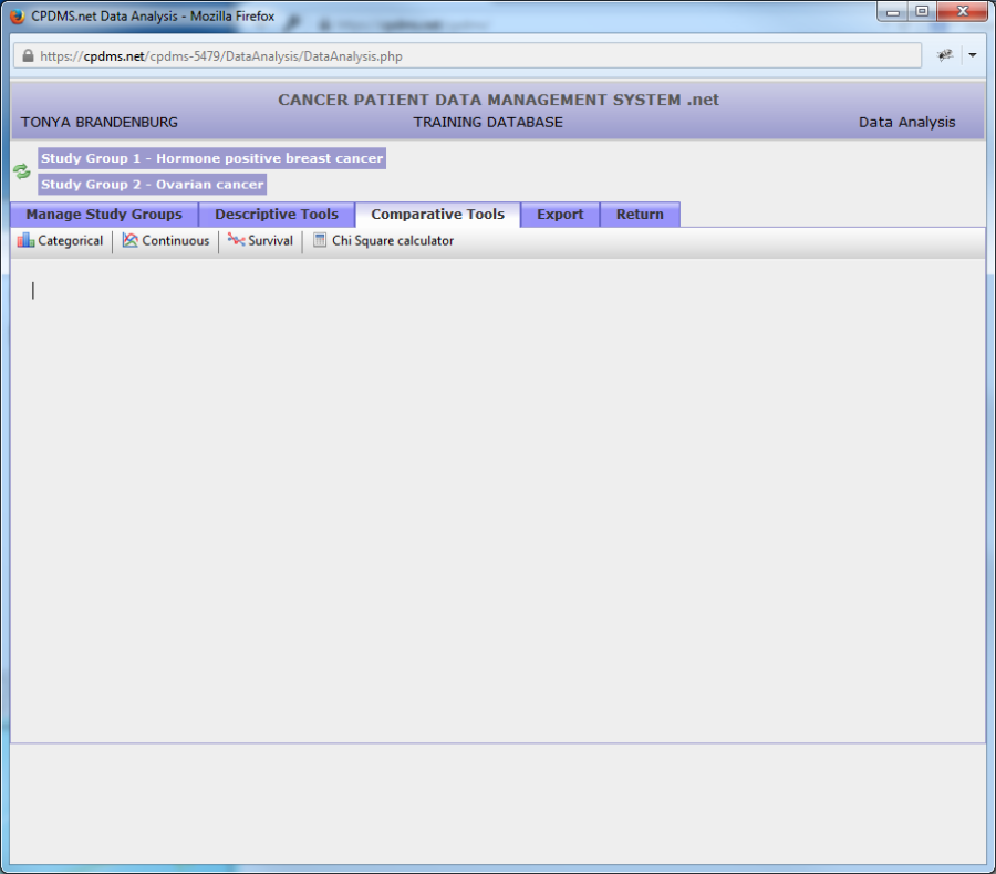
In order to compare two study groups, first select the groups as Study Group 1 and Study Group 2 (the order does not matter for purposes of comparison). Then click the Comparative Tools tab. The screen below is displayed.
Users may now compare a categorical variable, a continuous variable, or survival. A Chi Square calculator is also available for use in computing Chi Square for any data entered by the user.
Click on Categorical to compare a single categorical variable.
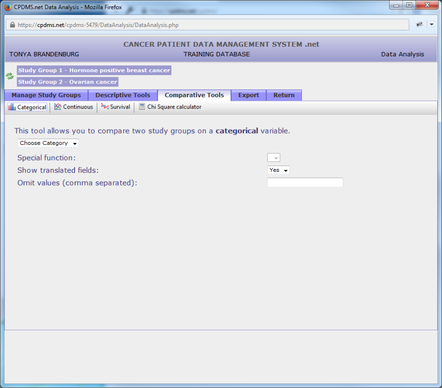
Select the data category which contains the field to be compared.
In the example below, the patient level field "Race 1" will be compared for the study groups "Hormone positive breast cancer" and "Ovarian cancer." As with descriptive tools for a single study group, a special function option is available for date fields which displays only the year. Fields may be shown translated or only as codes in the resulting report. Users may specify values to be omitted, if desired.
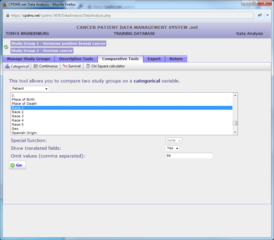
Click the "Go" button to generate the report.
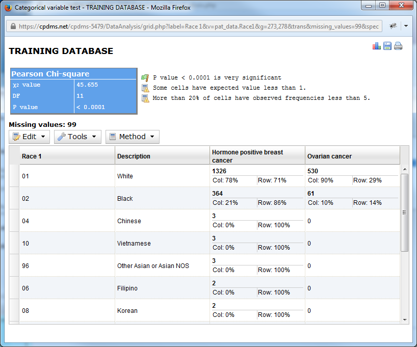
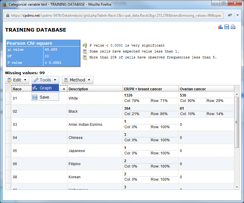
The resulting comparative report is shown below.

The name of the facility appears at the top of the report. The Chi Square results are displayed, along with a statement explaining the significance of the P value. Any missing values are listed.
The statistics are presented in a chart which shows both numbers and percentages. The percentages are calculated as both percentage of a particular value and of each study group.
The columns may be sorted by clicking on the column name. For example, clicking on "Description" would re-sort the report alphabetically in ascending order. Clicking a second time reverses the sort order.
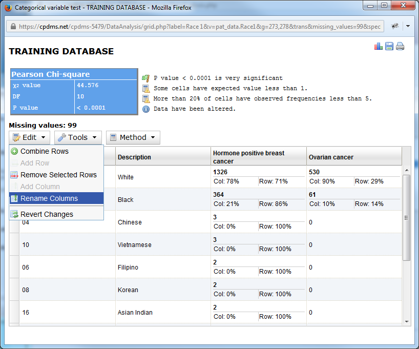
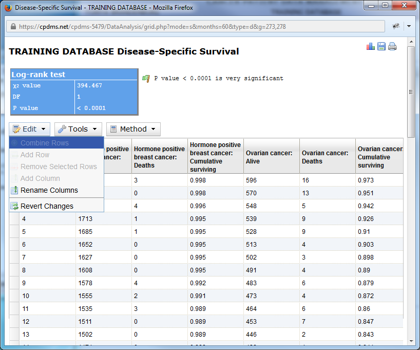
Further methods of manipulating the chart are available in the menus directly above it. Click on "Edit" to open the drop down menu.
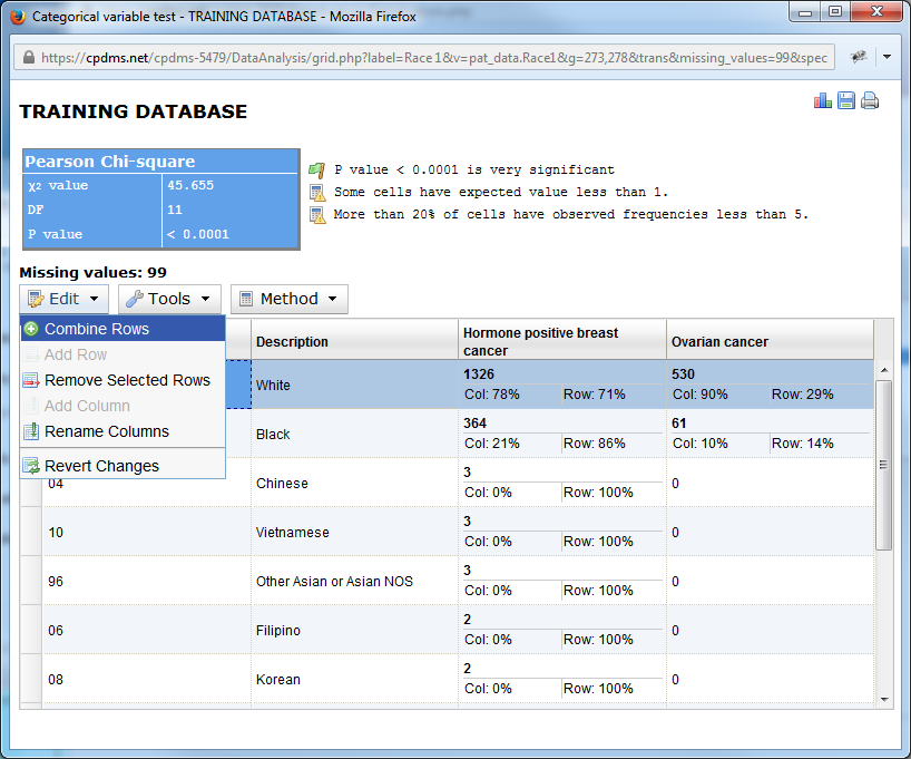
The options available include Combine Rows, Add Row (only available when using the Chi Square Calculator), Remove Selected Rows, Add Column (also only available in the Chi Square Calculator), Rename Columns, and Revert Changes.
The Combine Rows function merges two or more rows into a single row, adding the totals and recalculating the percentages. In order to combine rows, first highlight the rows which are to be merged holding the control key while clicking on the rows.
Columns appear blue when highlighted.
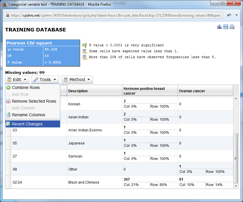
In the example below, the columns for 02- Black and 04- Chinese have been highlighted.
Once columns are highlight, choose "Combine Rows" from the Edit menu.
Now the two columns have been merged, as seen below.
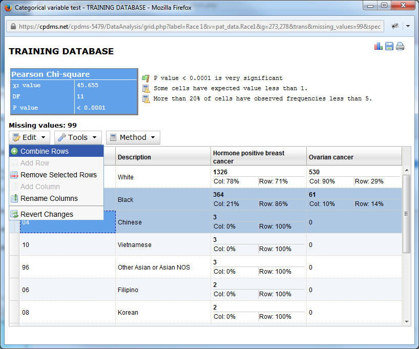
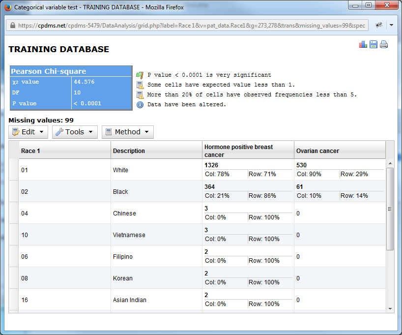
At any time after altering the chart, the changes may be undone by using the Revert Changes function.
Now the original appearance of the chart has been restored.
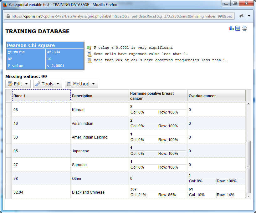
A selected row or rows may be removed from the chart altogether. Simply highlight the desired row(s) and choose Remove Selected Rows from the Edit menu.
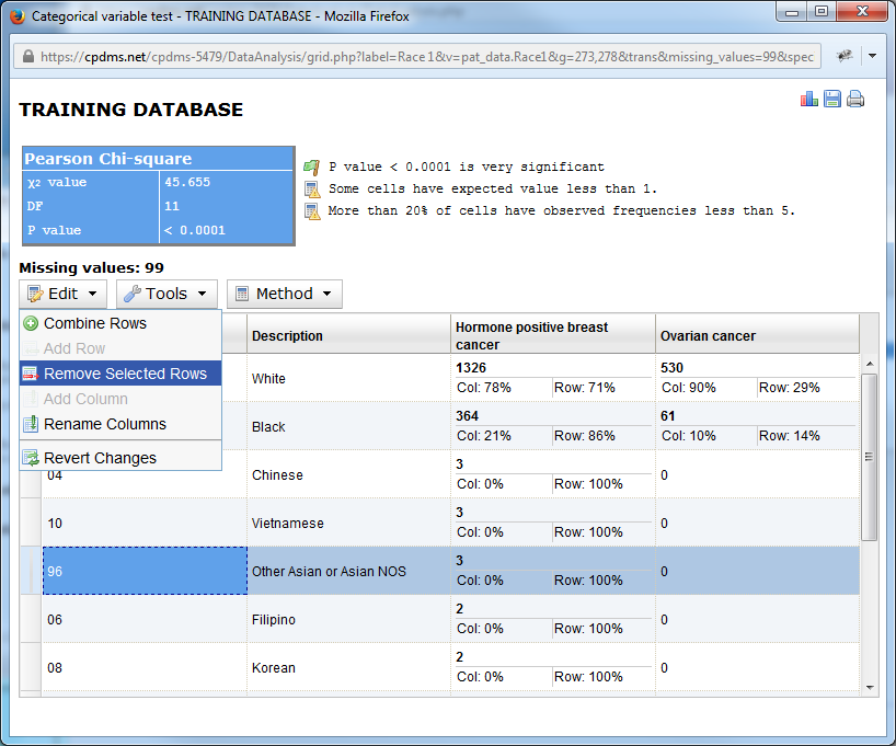
Now the row containing code 96 –Other Asian has been removed and the remaining values recalculated.
Users may also choose to rename a column in the chart. Doing so only changes the title of the column; it does not affect the study group title. Choose "Rename Columns" from the Edit menu.
A box opens which allows the user to rename any column heading. Simply type a new name and click "ok."
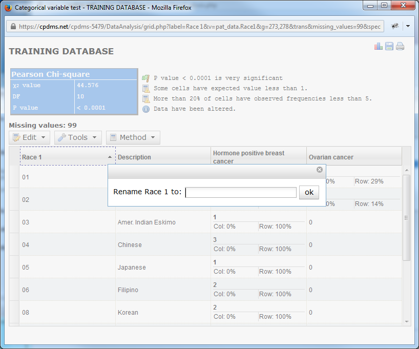
Users now have the opportunity to rename each column heading, from left to right. In order to retain the current label, simply click "ok" without typing anything in the box. Continue until every column has been renamed or skipped, at which point the box closes automatically.
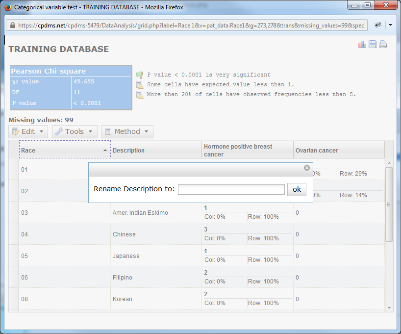
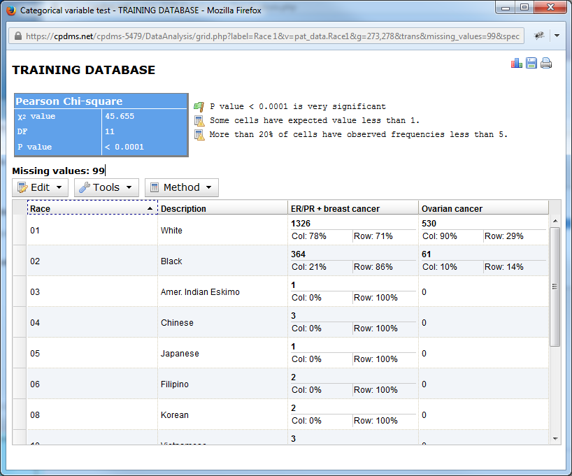
As seen below, the column previously entitled "Race 1" is now labeled "Race," and "Hormone positive breast cancer" is now "ER/PR+ breast cancer."
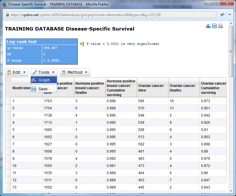
The Tools menu allows the user to graph the results or to save the chart as a .csv file. Note that icons in the upper right hand of the page also allow the user to graph or save, as well as to print the report.
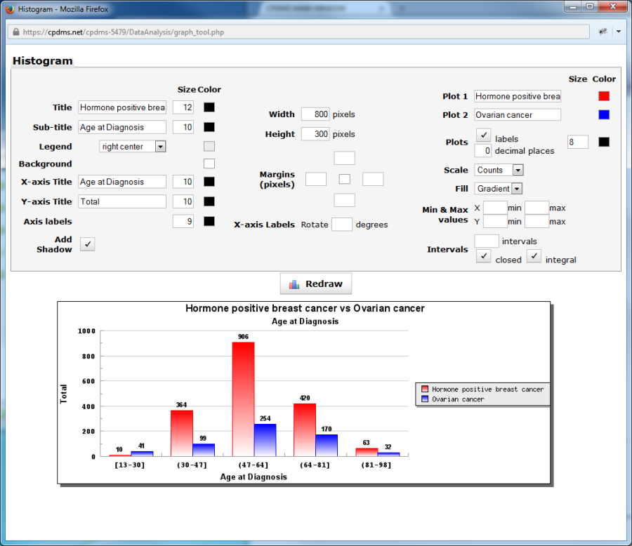
Choose "Graph" from the Tools menu to create a bar plot comparing the two study groups on the selected variable. The graph opens in a new window, with a bar plot displayed using default settings (see example below). These settings may be modified as explained on the following pages. Click the "Redraw" button to refresh the graph and display it with the new settings.
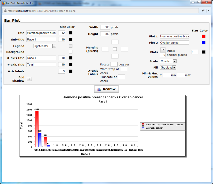
The default title of the graph displays the name of both study groups, while the sub-title is the field under comparison. The titles of either, as well as the font size and color may be edited. In order to change the font size, simply type a new value into the box to the right of the titles. Click on the box in the "Color" column to select from a menu of 70 colors.
A legend showing which colors correspond to each study group appears on the right side of the bar plot. The position of this legend may be adjusted using the drop-down menu. The background color of the legend may also be changed.
The default X-axis title is the variable being compared, and Y-axis title is "Total." Either title may be edited, along with the font size and color. The font size and color of the labels on both axes may be changed as well.
The width, height, and margins of the graph may be modified by typing a new pixel value. The boxes to the right of the word "Margins" correspond to the left, top, right, and bottom margins, respectively. The small box in the central allows users to choose the margin color.
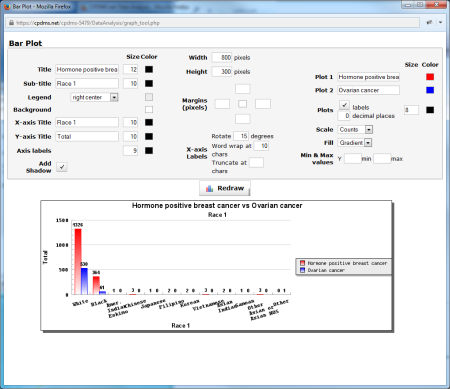
The X-axis labels may be changed in three ways. The labels may be rotated by entering a value in "Rotate degrees." In the example below, the labels have been rotated 45 degrees.
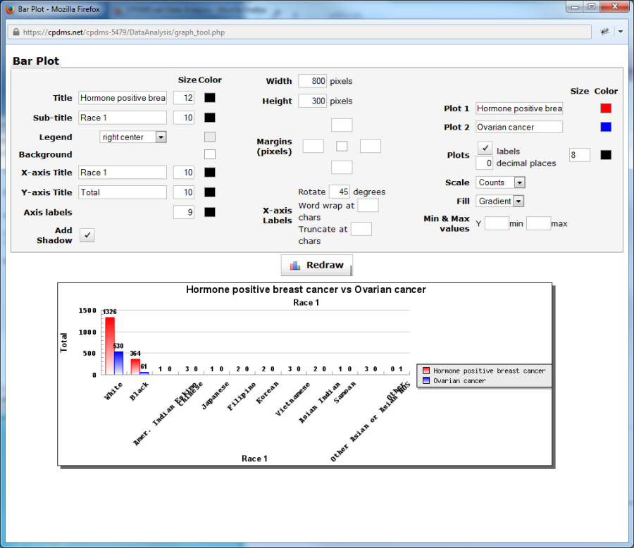
Longer labels may be wrapped or truncated to better fit in the bottom margin. Enter the maximum desired number of characters in the blank box to the right of "Word wrap at
chars" or "Truncate at chars."
In this example, the labels wrap for any phrase exceeding 15 characters. The label "Other Asian, Asian NOS" wraps to a second line, as seen below.
The plot names as they appear in the legend may be changed in "Plot 1" and "Plot 2." The color of the plots (within the plot and on the legend) may be modified by clicking on the "Color" boxes.
By default, labels with counts appear directly above the individual bars. In the graph above, the counts for Whites are 580 for the hormone positive breast cancer study group and 401 for the ovarian cancer group.
Uncheck the "Labels" box to the right of "Plots" to generate a bar plot without the counts labeled. Users may specify the font size and color of these labels, as well as the number of decimal places displayed.
"Scale" allows the user to choose either counts or percentages to be displayed. "Fill" changes the appearance of the color inside the bars. It can be a gradient (the default setting), solid, or unfilled.
Minimum and maximum values for the Y axis may be adjusted by entering new values.
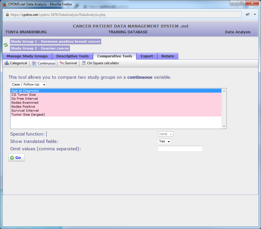
In order to compare a continuous variable for two groups, select the groups to be studied, and then click on "Continuous" in the Comparative Tools toolbar.

Choose the data category to which the variable to be compared belongs. The default report will display translated field names, but users may opt to show them un-translated. User may also specify certain values to be omitted from analysis.
In the example seen below, the variable "Age at Diagnosis" will be compared. Click "Go" to generate the report.
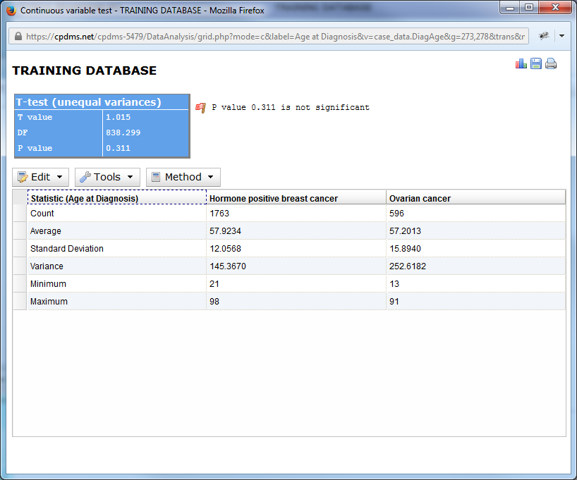
The output for comparison of continuous variables displays, for each group, the total count of records in the group, the average, standard deviation, variance, and maximum and minimum values. The result of the T-test appears above the chart, and a statement revealing the P value to be highly significant, significant, or not significant.
As with comparative reports for categorical variables, menu options are displayed above the chart. However, some of these options are unique to the continuous variable report. Click on "Edit" to display the options available.
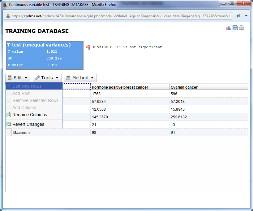
Only "Rename Columns" and "Revert Changes" are available for selection. As with categorical reports, these options allow users to rename the column headings in the chart, and to undo any changes made, respectively.
In the Tools menu, users may choose to graph the results or save them as a .csv file. The icons in the upper right corner of the screen can also be used to graph, save, or print the report.
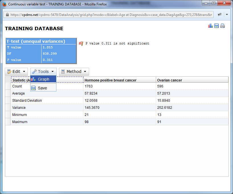
Finally, users may choose to use a Z-test (instead of the default T-test) as the basis for analyzing variance in that field between the two groups.
Comparisons of continuous variables are represented graphically as a histogram.
To generate a graph, either choose "Graph" from the Tools menu, or click the graph icon in the upper right corner. The graph editor opens in a new window.
A graph is automatically generated with default values and colors. However, these can be modified and the graph redrawn (click the "Redraw" button to display any changes). Most of the graph elements for the histogram are identical to those in those in the bar plot that results from a categorical variable. Users may rename the title, sub-title, and X- and Y-axis titles, as well as changing their size and color. The legend can be moved to a different position, and the color of the legend and background may be modified. The graph can be rendered with or without a drop shadow, and the width and height may be adjusted. The size and color of the margins can also be changed. The X-axis labels can be rotated (although not wrapped or truncated). The names and colors of the plots can be altered, and users may choose to display the plots with or without labels. The plot labels themselves may have their font size and color changed. The scale may be displayed in actual counts or percentages. The default fill appearance of the bar color is a gradient, but users may choose either solid or no fill at all. Maximum and minimum values may be assigned to the X- and Y-axes.
Users may also adjust the intervals in a histogram. The number of intervals will determine the value range represented by each bar in the histogram. For example, if Minimum and Maximum for the X-axis are zero and one hundred, respectively, and the number of Intervals is ten, then each bar will correspond to a value range of ten. (See below.)
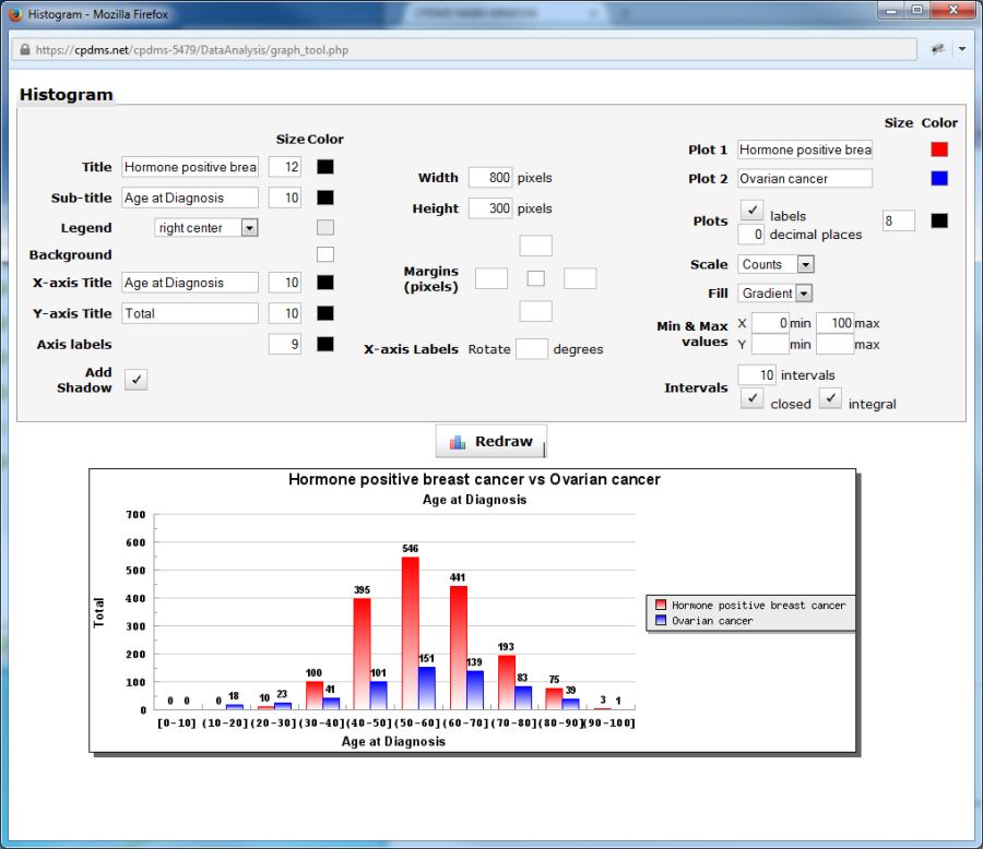
The default setting for the intervals displayed is closed. When an interval between two numbers is closed, this indicates that the upper boundary is included in the range. An open interval is one in which the upper boundary is not included within the range. So in the above example, a 40 year old is included with the 30-40 grouping, not the 40-50.
When Integral is checked (the default setting), the ranges on the X axis of the histogram are shown as integers, as seen above. When Integral Intervals is unchecked, the range endpoints are displayed with up to two decimal places. Right click on the graph and choose "Save Picture As" to save it as a bitmap image file. Simply close the window to escape the graph editor.
Survival rates for two groups may also be compared and graphed. Select two study groups, and then click "Survival" in the Comparative Tools menu.
The default time period for survival analysis is 24 months, but this may be overwritten with another value. Chose "Disease-specific" or "Observed." Click "Go" to generate the report.
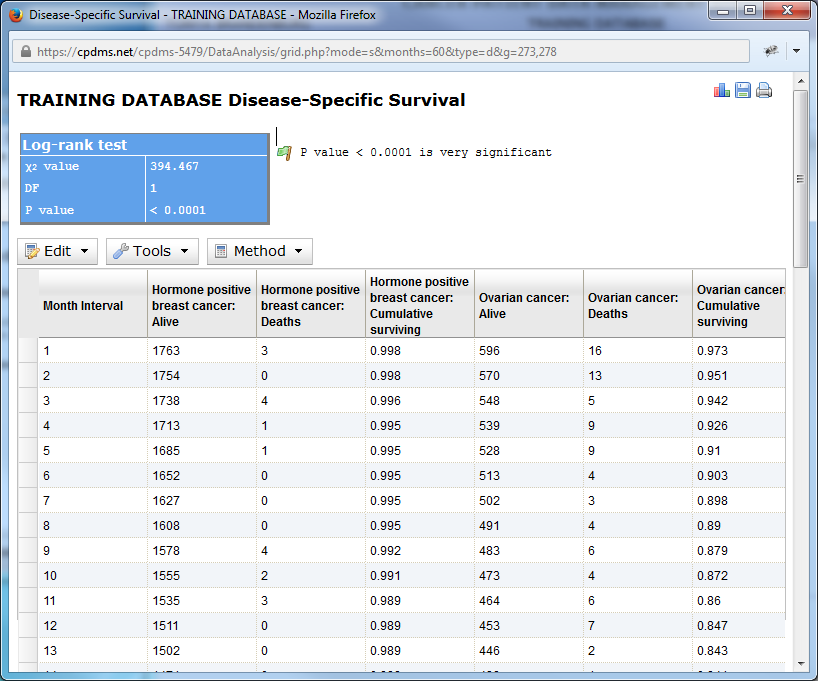
Below is an example using a sixty month period. An actuarial table with both groups represented is displayed, along with the results of the Chi Square test and the P value. An interpretation of the P value (in this case, very significant) is provided as well.
The Edit menu allows users to rename column headings and to undo any changes.
The Tools menu allows the table to be graphed or saved as a .csv file. The icons in the upper right of the page can also be used to graph or save the table, as well as to print it.
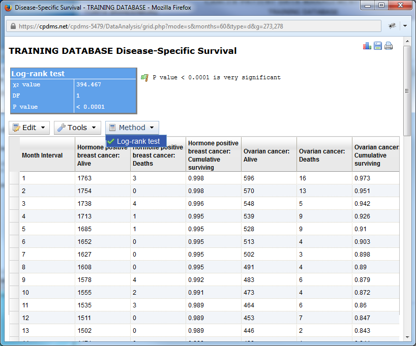
A single method (the log-rank test) is used to generate the table, so no other options are available.
Survival curves can be generated by clicking the graph icon in the upper corner or by selecting "Graph" from the Tools menu. A survival trend is automatically displayed using the default settings and colors (as seen below).
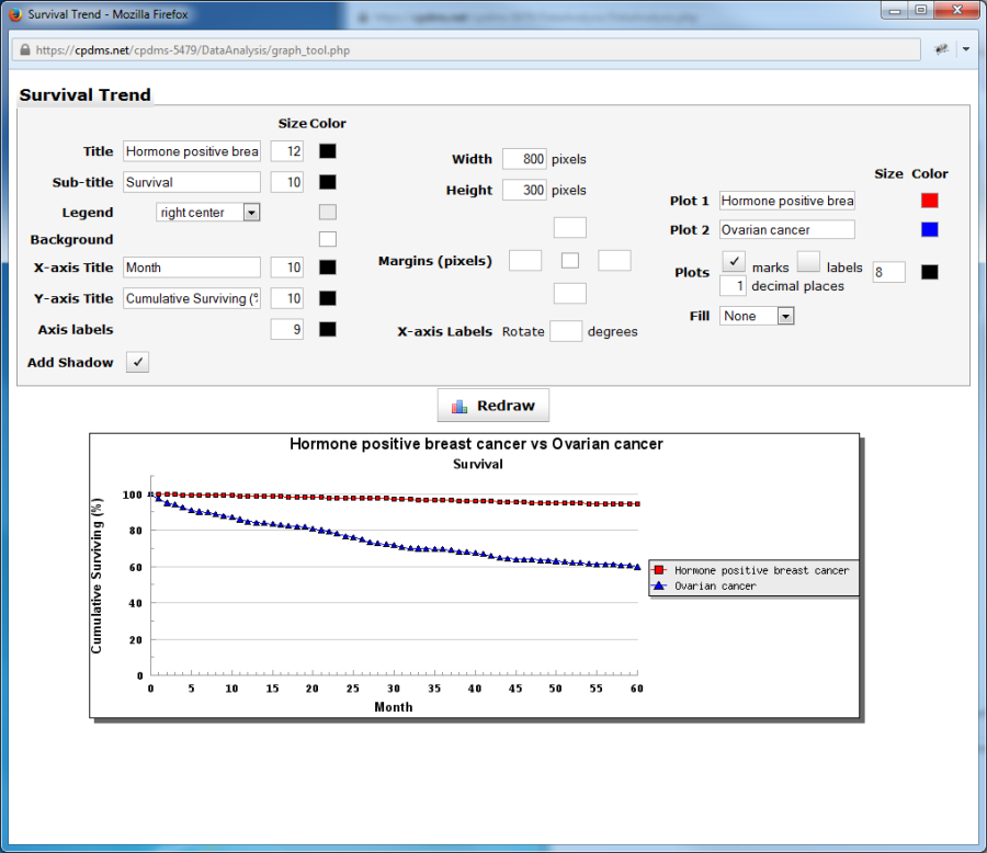
The appearance of many aspects of the survival trend may be modified (click the "Redraw" button to display any changes) as described in the previous sections for bar plots and histograms. The graph elements which are unique to survival trends are the plots and fill. The plots may have each month marked (with either a square or triangle, as indicated by the legend), or displayed as a simple line. Uncheck the "Marks" box to the right of Plots to display only a line. Each mark can be labeled, if desired, by clicking the "Labels" box. The number of decimal places for the labels may be specified. Finally, the area beneath the lines can be filled in with either solid color or a gradient (the default is solid). Right click on the graph to save it as a bitmap image file, and close the browser window to escape the Graph Editor.
A free-standing Chi Square calculator is available for the convenience of users. To access it, click on "Chi Square Calculator" in the Comparative Tools toolbar. A blank chart is now displayed, as seen below.
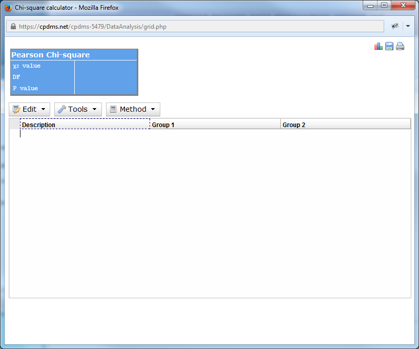
To begin, open the Edit menu. Here users may combine rows, add and remove rows, add columns, rename column headings, and undo any changes made.
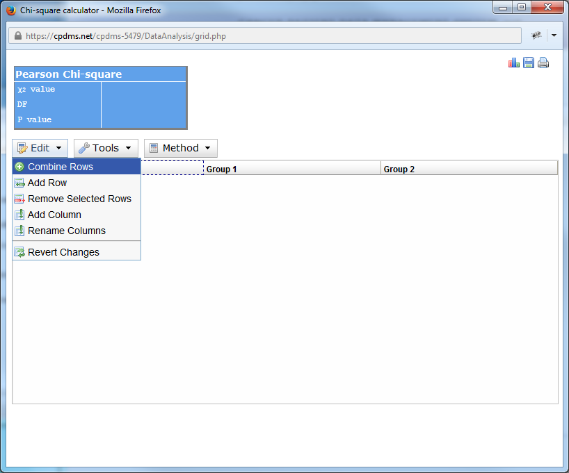
Clicking on "Add row" adds a blank row to the chart.

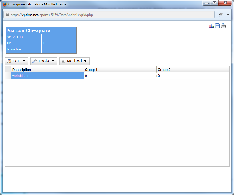
Double click on the description "new item" and type in a name for the variable being described.
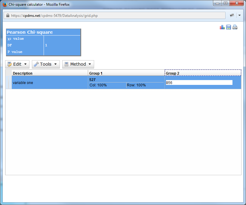
Double-click on the zero in each column to enter the number of that particular variable from each group. Users may add as many columns or rows as desired. As soon as values are entered, the percentages are automatically calculated, as are the Chi Square and P value. The default calculation uses the Yates Chi Square, but users may select Pearson instead by clicking on the Method menu.
The results may be saved as a .csv file, graphed as a bar plot, or printed.
Export Data
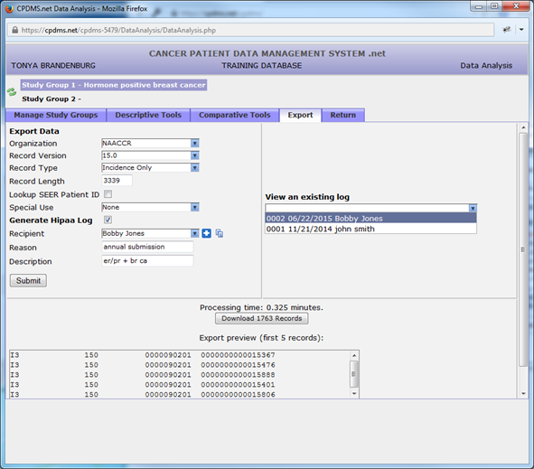
A group of records may be exported as a NAACCR version 16.0 file. Select the records to be exported as Study Group 1. From the Data Analysis menu, click the “Export” tab.
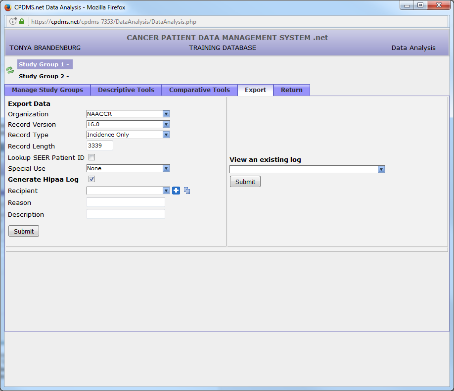
At this time, records may only be exported in NAACCR 16.0 format, with a record length of 3339 characters. Users may choose the type of record from three levels of confidentiality: incidence only (no confidential identifiers), confidential (includes confidential identifiers), and full case abstract (the entire record).
Users also have the option to create a HIPAA log to record the release of data. In order to specify a recipient, click the “plus” sign to the right of the drop-down menu. Enter the name, address, and contact information of the recipient, and click “Save” to preserve the information.
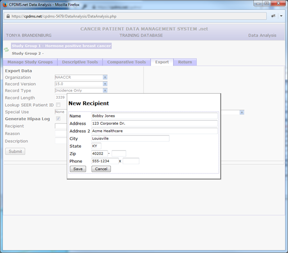
All recipient records which have been created are thereafter available for selection from the drop-down menu. To edit information for an existing recipient, select the desired record and click the ![]() icon. That record may then be modified and saved.
icon. That record may then be modified and saved.
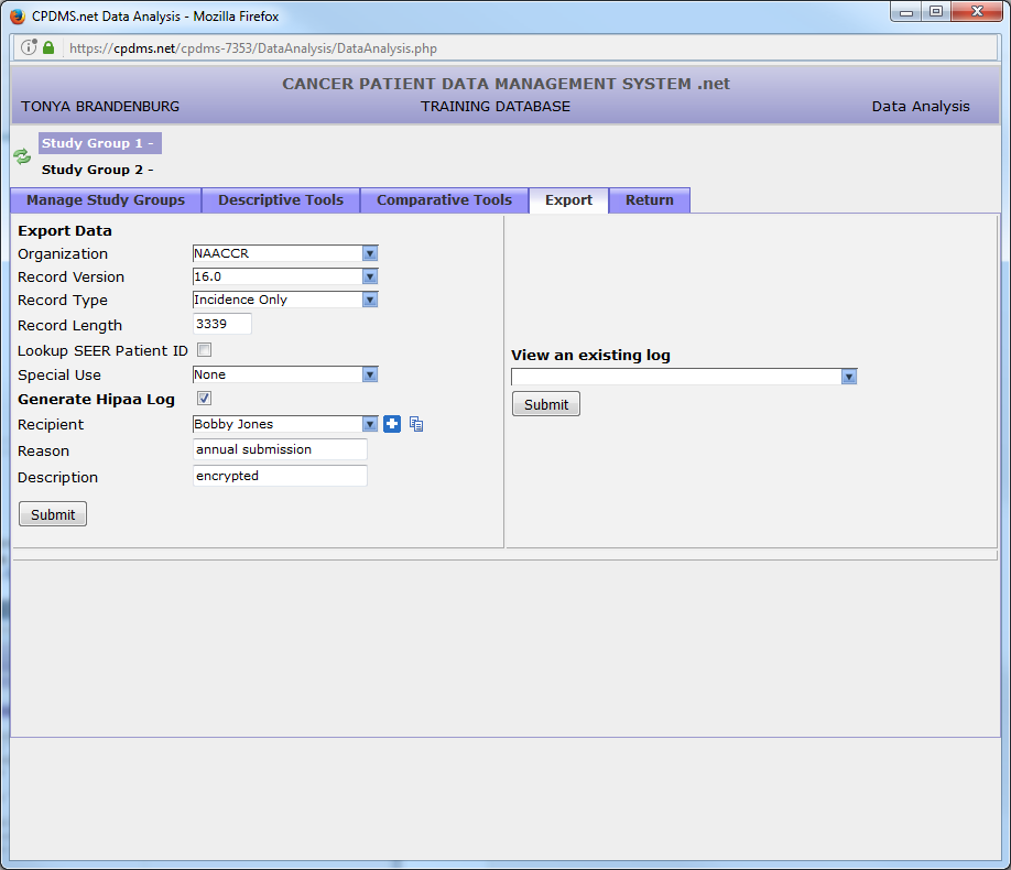
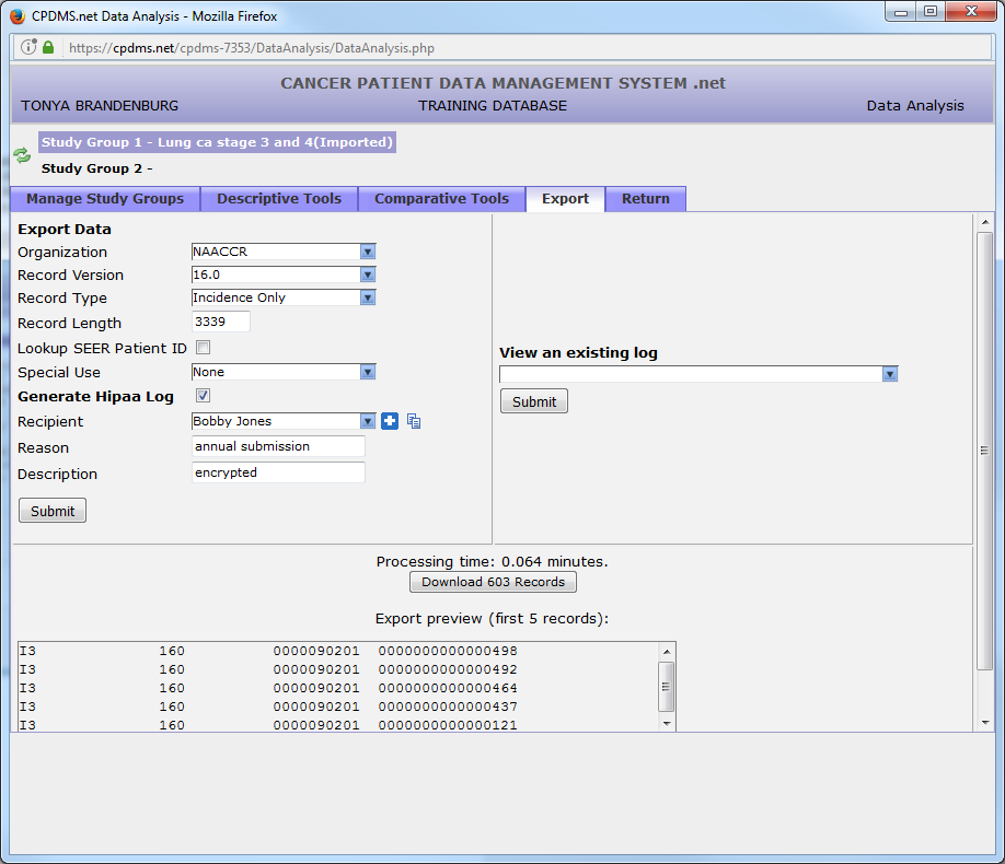
Two optional fields are available for users to record the reason for the data release as well as a brief description of the records contained in the export file. Click “Submit” to generate the export file.
A preview of the resulting file (containing only the first 5 records) is available for viewing to ascertain that the file was compiled correctly and contains the type of record specified. Click on the “Download” button to save the file (note that this button also lists the number of records in the file).
To view a HIPAA log, click the drop-down menu beneath “View an existing log” and select the desired log (based on date and recipient). Click the “Submit” button to view the log.
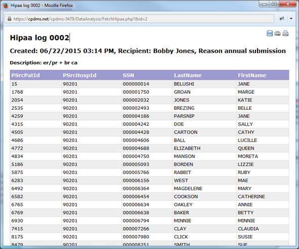
An example HIPAA log is seen below. It can be re-sorted by clicking any of the column headings. Like all reports in CPDMS.net, it can be saved or printed using the icons in the upper right corner of the page.
Data Dictionary
Click on the i and CPDMS provides a data dictionary download in Data Analysis with information about column name, required field, possible values, and link to CPDMS manual page.
For Example:
Column | Required | Definition/Coding | NAACCR Field ID | Reference |
|---|---|---|---|---|
Registry Accession Year | yes | See link for more information | 30320 | {+}http://www.kcr.uky.edu/manuals/cpdms-help/gethelp.php?searchTerm=AccYear&searchLabel=30320+ |
Registry Accession No | yes | See link for more information | 30330 | {+}http://www.kcr.uky.edu/manuals/cpdms-help/gethelp.php?searchTerm=AccNo&searchLabel=30330+ |
Case Sequence Num | yes | See link for more information | 30030 | {+}http://www.kcr.uky.edu/manuals/cpdms-help/gethelp.php?searchTerm=SeqNo&searchLabel=30030+ |
Case Site Code | yes | 01 = Lip | 30040 | {+}http://www.kcr.uky.edu/manuals/cpdms-help/gethelp.php?searchTerm=SiteCode&searchLabel=30040+ |
02 = Tongue | ||||
03 = Salivary glands | ||||
04 = Gum & hard palate | ||||
05 = Floor of mouth | ||||
06 = Buccal mucosa | ||||
07 = Oropharynx | ||||
08 = Nasopharynx | ||||
09 = Hypopharynx | ||||
10 = Other oral cavity | ||||
11 = Esophagus |